The Card vault integrates features like wallets and tokenization without processing the payment.
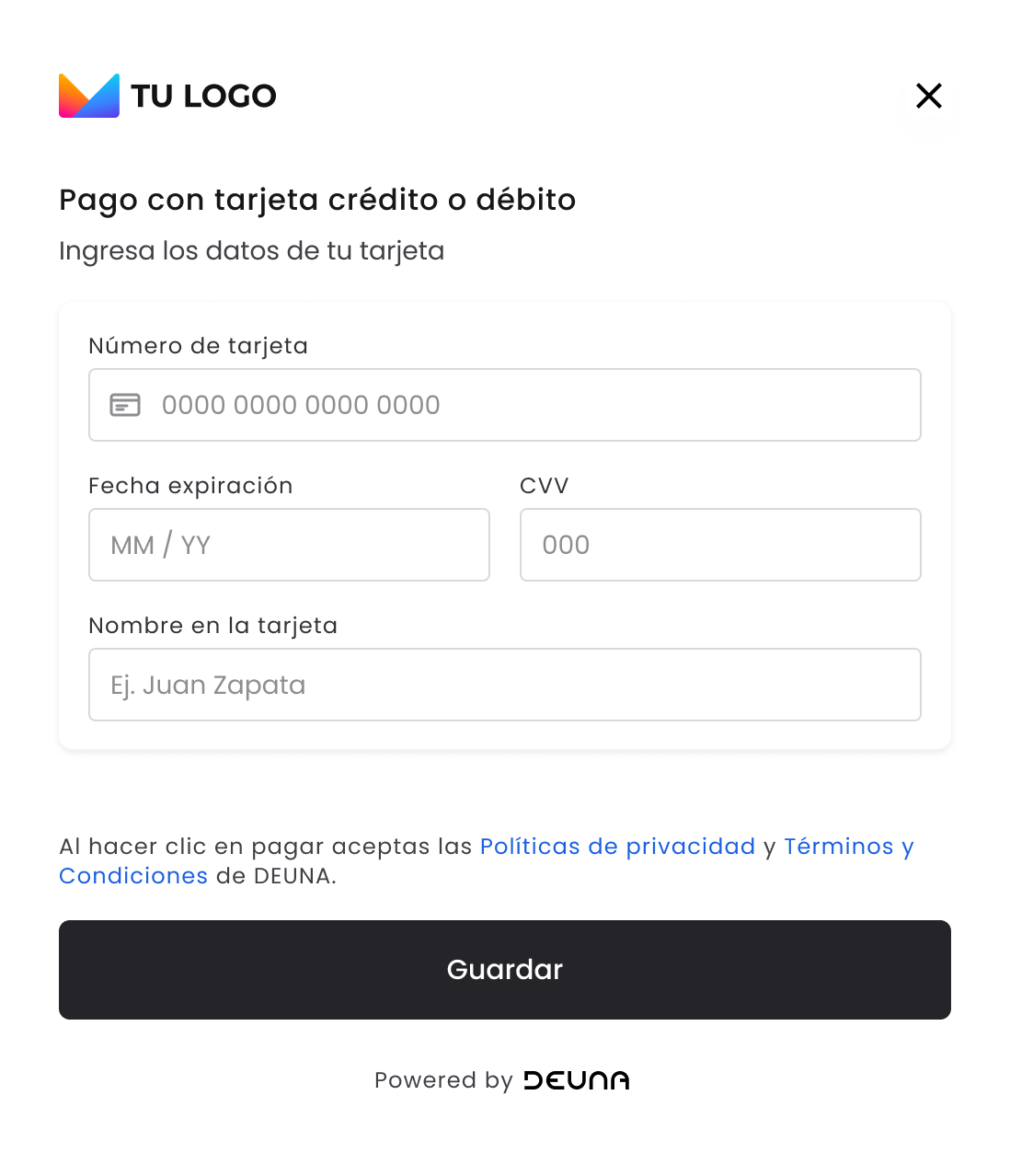
The Card vault is a component of DEUNA Payment solutions and contains different types of widgets that allow you to:
- Store credit and debit cards securely in the Vault.
- Make Click To Pay payments with the Click To Pay widget.
Initialize the widget
Before integrating the Payment widget, complete the First steps - Web.
1. Display the widget
Display the widget on your application in two ways:
- On a modal
- Embedded
Display on a modal
Follow the following steps to show the DEUNA Vault widget in a modal:
- Create an instance of the
DeunaSDKclass. - Add the
DeunaWidgetcomponent to your view. - Call the
initElementsfunction.
import { DeunaSDK, DeunaWidget } from "@deuna/react-native-sdk";

const YourScreen = () => {
  const onShowWidget = () => {
    deunaSDK.initElements({
      userToken: "<DEUNA user token>", // optional
      userInfo: {
        firstName: "Esteban",// optional if userToken is provided
        lastName: "Posada",// optional if userToken is provided
        email: "[email protected]",// required
      }, // optional
      callbacks: {
        onSuccess: async (data) => {
          await deunaSDK.close(); // Close the widget
          console.log("Success", data);
          // Handle success
        },
        onError: async (error) => {
          console.error("Error:", error);
          await deunaSDK.close(); // Close the widget
          // Handle error
        },
        onClosed: (action) => {
          console.log("Widget closed with action:", action);
          // Handle close action
        },
        onEventDispatch: (type, response) => {
          console.log("Event:", type, response);
          // Handle specific events
        },
      },
      widgetExperience: {
        userExperience: {
          showSavedCardFlow: false, // optional
          defaultCardFlow: false, // optional
        },
      },
    });

    return (
      <View>
        <DeunaWidget instance={deunaSDK} />
        <Button
          onPress={onShowPaymentWidget}
          title="Show Widget"
        ></Button>
      </View>
    );
  };
};
Display embedded widget
To show the DEUNA widget in embedded form you will need to pass the parameter mode: Mode.EMBEDDED when you call the initElements function.
To correctly visualize the DEUNA widget in embedded form, the DeunaWidget component must be inside a component that delimits its dimensions.
import {
  DeunaSDK,
  DeunaWidget,
  Mode, // AGREGAR ESTA LINEA
} from "@deuna/react-native-sdk";

const YourScreen = () => {
  const onShowWidget = () => {
    deunaSDK.initElements({
      userToken: "<DEUNA user token>", // optional
      mode: Mode.EMBEDDED,
      userInfo: {
        firstName: "Esteban",// optional if userToken is provided
        lastName: "Posada",// optional if userToken is provided
        email: "[email protected]",// Required
      }, // optional
      callbacks: {
        onSuccess: async (data) => {
          await deunaSDK.close(); // Close the widget
          console.log("Success", data);
          // Handle success
        },
        onError: async (error) => {
          console.error("Error:", error);
          await deunaSDK.close(); // Close the widget
          // Handle error
        },
        onClosed: (action) => {
          console.log("Widget closed with action:", action);
          // Handle close action
        },
        onEventDispatch: (type, response) => {
          console.log("Event:", type, response);
          // Handle specific events
        },
      },
    });

    return (
      <View>
        {/* Delimita las dimensiones del Widget */}
        <View style={{ flex: 1, width: "100%" }}>
          <DeunaWidget instance={deunaSDK} />
        </View>
        <Button onPress={onShowWidget} title="Show Payment Widget"></Button>
      </View>
    );
  };
};
Parameters
| Parameter | Description |
|---|---|
callbacks | Callbacks that are called in case of success, error, or when the widget is closed. |
userToken (optional) | The bearer token of the DEUNA user. When this is sent, all actions within the widget are done on this DEUNA user. For this userToken to be used and the saved cards to be shown to the customer, the email associated with that userToken must be the same one sent when creating the order in billing_address.email in case an orderToken is passed. If the two emails don't match, then the flow is used without displaying the cards for security reasons. https://docs.deuna.com/reference/users-register https://docs.deuna.com/reference/request-otp https://docs.deuna.com/reference/login-with-otp |
orderToken(optional) | The orderToken is a unique token generated for the payment order. This token is generated through the DEUNA API and you must implement the corresponding endpoint in your backend to obtain this information. IMPORTANT: User information that is available in the following can be extracted: billing_address to use within the widget. |
userInfo | User information to be passed to the widget, possible information available to pass are: Note: The |
styleFile (optional) | UUID provided by DEUNA. This applies if you want to configure a custom styles custom file (change colors, texts, logo, and so on). If a valid value is provided for styleFile The Vault widget will use the UI settings provided by the theme configuration that matches the provided UUID. |
types(optional) | A list of the widget types that the initElements function should render. Allowed values are: vault and click_to_pay . Example: Payment solutions and contains If this parameter is not passed, then the DEUNA Vault widget are displayed by default to store credit and debit cards. |
language(optional) | This parameter allows you to specify the language in which the widget interface is displayed. It must be provided as a valid language code (for example, "es" for Spanish, "en" for English, "pt" for Portuguese). Behavior:
|
widgetExperience(optional) | Overrides merchant settings. The following are currently supported by the widget: userExperience.showSavedCardFlow: Shows card saving toggle. userExperience.defaultCardFlow: Displays toggle to save card as default. |
hidePayButton (optional) | If set to true, then the widget's payment button will be hidden, allowing for completely manual payment management. This means the user must explicitly call the methods isValid() and submit() to process the transaction. |
domain (optional) | This optional parameter is used to override the base host when the vault widget URL is loaded. It replaces the default host (elements.deuna.com) with the domain you provide. Example: If you pass the domain |
Click To Pay widget
Using the types parameter of the initElements function you can make a payment with Click To Pay.
TheuserInfoparameter is mandatory to be able to show the Click To Pay widget.
deunaSDK.initElements({
  // In web context, we don't need the 'context' parameter
  userInfo: {
    firstName: "Esteban",
    lastName: "Posada",
    email: "[email protected]"
  }, // Required for Click to Pay
  types: [
    {
      name: "click_to_pay" // Shows Click to Pay widget
    }
  ],
  callbacks: {
    onSuccess: async (data) => {
      await deunaSDK.close();
      console.log('Success', data);
      // Handle successful payment
    },
    onEventDispatch: (eventType, data) => {
      console.log('Event:', eventType, data);
      // Handle specific events
    },
    onError: (error) => {
      console.error('Error:', error);
      // Handle payment error
    },
    onClosed: (action) => {
      console.log('Widget closed:', action);
      // Handle widget close
    }
  }
});
2. Listen to widget events
It's crucial to adequately handle the widget events to offer a fluid experience to users. Define the necessary callbacks to update your application interface.
Callbacks
| Callback | Modal | Embedded | Trigger |
|---|---|---|---|
onSuccess | ✅ | ✅ | Executed when a card is successfully saved or when a Click to Pay payment is successful. This callback contains a JSON parameter. |
onError | ✅ | ✅ | Executed when an error occurs while saving the card. This callback contains a JSON parameter that identifies the type of error that occurred. |
onClosed (Opcional) | ✅ | ❌ | Runs when the payment widget is closed. This callback contains a string parameter whose values can be one of the following:
|
onCardBinDetected (Opcional) | ✅ | ✅ | Runs when the payment widget detects the BIN of an entered credit or debit card or when the user deletes the entered card number. This callback contains a parameter of type JSON with the bin information and card brand entered. The JSON type parameter will be null when the user deletes the text entered in the card number field. |
onEventDispatch (Opcional) | ✅ | ✅ | It is run on all events that the widget can produce. This callback contains a string parameter and the data (JSON) associated with that event. |
4. Close the widget
The close function liberates the Payment widget resources closes the widget if it was shown in a modal.
It's very important to liberate the widget resources when you no longer need them to avoid memory loss.
The following example code shows how to close the widget when a card is tokenized successfully.
deunaSDK.initPaymentWidget({
  .
  .
  .
  callbacks: {
    onSuccess: async(data) => {
      await deunaSDK.close(); // Close Payment widget
      // Example: Redirect to success page
    },
  }
});
When the DEUNA widget is shown in a modal, its resources are liberated on closure.
However, if the widget is shown in embedded form and the user abandons your view, then it's necessary to liberate the widget resources.
import { DeunaSDK, DeunaWidget, Mode } from "@deuna/react-native-sdk";

const YourScreen = () => {
  useEffect(() => {
    return () => {
      deunaSDK.close(); // Release the widget resources
    };
  }, []);

  const onShowWidget = () => {
    deunaSDK.initElements({
      userToken: "<DEUNA user token>", // optional
      mode: Mode.EMBEDDED,
      userInfo: {...}, // optional
      callbacks: {...},
    });

    return (
      <View>
        {/* Delimits widget dimensions */}
        <View style={{ flex: 1, width: "100%" }}>
          <DeunaWidget instance={deunaSDK} />
        </View>
        <Button onPress={onShowWidget} title="Show Widget"></Button>
      </View>
    );
  };
};
Optional functionalities
Besides the mandatory steps to operate the widget, you have the following customization options.
Customize the widget appearance
Use the setCustomStyle function to customize the widget appearance:
await DeunaSDK.setCustomStyle({...});
For more information, refer to Customizing styles.
Example
deunaSDK.initElements({
  orderToken: "<DEUNA order token>",
  userToken: "<DEUNA user token>", // optional
  callbacks: {
    onCardBinDetected: (cardBinMetadata: any) => {
      deunaSDK.setCustomStyle({
        theme: {
          colors: {
            primaryTextColor: "#023047",
            backgroundSecondary: "#8ECAE6",
            backgroundPrimary: "#F2F2F2",
            buttonPrimaryFill: "#FFB703",
            buttonPrimaryHover: "#FFB703",
            buttonPrimaryText: "#000000",
            buttonPrimaryActive: "#FFB703"
          }
        },
        HeaderPattern: {
          overrides: {
            Logo: {
              props: {
                url: "https://images-staging.getduna.com/ema/fc78ef09-ffc7-4d04-aec3-4c2a2023b336/test2.png"
              }
            }
          }
        }
      });
    },
    onSuccess: async(order: any) => {
      await deunaSDK.close();
      // Your success handling
    }
    // ... other callbacks
  }
});
Hide the payment button (embedded)
When the widget is shown in embedded form the hidePayButton property can be used to hide the pay button of the DeunaWidget.
deunaSDK.initElements({
  ...
  mode: Mode.EMBEDDED, // AGREGAR ESTA LINEA
  hidePayButton: true, // AGREGAR ESTA LINEA
  callbacks: {...},
});
You can use the following functions to validate and run the payment.
| Method | Description | Response |
|---|---|---|
.isValid() | Validates if input information is correct and if the payment can be processed. | true if valis, false otherwise. |
.submit() | Executes payment process, equivalent to clicking on "pay". | { status: "success", message: "Payment processed successfully" } o { status: "error", message: "The submit flow is not available" } |
Considerations
- You should use
isValid()before callingsubmit()to avoid errors in the payment process. - If the payment flow is not yet available, then
submit()returns an error with the message"The submit flow is not available".