The Card vault integrates functionalities like wallets and tokenization without processing the payment.
DEUNA's Payment Vault contains different types of widgets that allow you to:
- Save credit and debit cards securely in the Vault.
- Make payments with Click To Pay using the Click To Pay Widget.
Initialize the Widget
Before integrating the Payment Widget, complete the First Steps - iOS.
1. Display the Widget
Display the Payment Vault Widget in two ways:
- Modal: Call a function to show the Widget.
- SwiftUI: Show the embedded Widget.
Show in a Modal
To show the Payment Widget in a modal (pageSheet) call the initElements function passing the following data:
deunaSDK.initElements(
    userToken: "<DEUNA user token>", // optional
    callbacks: ElementsCallbacks(
        onSuccess: { response in
            self.deunaSDK.close() // Close the Vault Widget
        },
        onError: { error in
            // Error handling
            self.deunaSDK.close() // Close the Vault Widget
        },
        onClosed: { action in
            // The Vault Widget was closed
        },
        onEventDispatch: { type, response in
            // Listen to events
        }
    ),
    userInfo: DeunaSDK.UserInfo(
        firstName: "Esteban", // Optional if userToken is provided
        lastName: "Posada", // Optional if userToken is provided
        email: "[email protected]" // required
    ),
  	types: ..., // optional, If this value is not passed, the VAULT Widget will be shown by default.
		orderToken: "<DEUNA order token>",
    widgetExperience: ElementsWidgetExperience( // Optional
        userExperience: ElementsWidgetExperience.UserExperience(
            showSavedCardFlow: true, // Optional
            defaultCardFlow: true // Optional
        )
    )
)
Show Embedded Widget (SwiftUI)
Use the DeunaWidget view to show the payment widget embedded in your app with SwiftUI.
import DeunaSDK
import SwiftUI

struct YourView: View {
    let deunaSDK: DeunaSDK
    var body: some View {
        VStack {
            DeunaWidget(
                deunaSDK: deunaSDK,
                configuration: ElementsWidgetConfiguration(
                    userToken: "<DEUNA user token>", // optional
                    callbacks: ElementsCallbacks(
                        onSuccess: { res in
                           // NOTE: Explicitly release widget resources
                           // when no longer needed
                           // to prevent memory leaks and ensure proper cleanup.
                            deunaSDK.dispose()
                        },
                        onError: { error in
                            // Error handling
                        },
                        onEventDispatch: { event, data in
                            // Listen to events
                        }
                    ),
                    userInfo: DeunaSDK.UserInfo(
                        firstName: "Esteban", // Optional if userToken is provided
                        lastName: "Posada", // Optional if userToken is provided
                        email: "[email protected]" // required
                    ),
										orderToken: "<DEUNA order token>"
                )
            )
        }
    }
}
Auto Resize
By default, DeunaWidget fills its parent container at a fixed height. Passing an AutoResizeConfig switches the vault widget to auto-resize mode: it grows and shrinks to match the WebView content height, making it suitable for embedding inside a ScrollView alongside other content.
Keyboard interactions are handled automatically in auto-resize mode. When a user taps an input and the keyboard appears, the outer ScrollView scrolls by exactly the amount needed to keep the focused input visible — no manual configuration required beyond wiring the scroll callback below.
let widgetConfig = ElementsWidgetConfiguration(
    userToken: "...",            // or pass userInfo: instead
    callbacks: ElementsCallbacks(...),
    autoResizeConfig: AutoResizeConfig(initialHeight: 150)
)
.
.
.

import DeunaSDK
import SwiftUI
import UIKit

struct MyVaultView: View {
    let deunaSDK: DeunaSDK
    let widgetConfig: DeunaWidgetConfiguration

    @State private var outerScrollView: UIScrollView?

    var body: some View {
        ScrollView {
            VStack(spacing: 0) {
                // ScrollViewFinder must be the first child of the VStack.
                // SwiftUI ScrollView does not expose its underlying UIScrollView
                // directly, so this invisible view walks up the UIKit hierarchy
                // at layout time to capture it. Placing it first guarantees it
                // is attached to the view tree before any scroll interaction occurs.
                Color.clear.frame(height: 0)
                    .background(ScrollViewFinder { sv in outerScrollView = sv })

                // ... your content above the widget ...

                DeunaWidget(deunaSDK: deunaSDK, configuration: widgetConfig)
                    .onScrollNeeded { overlap in
                        guard let sv = outerScrollView else { return }
                        let newOffset = CGPoint(x: 0, y: sv.contentOffset.y + overlap)
                        UIView.animate(withDuration: 0.25, delay: 0, options: .curveEaseOut) {
                            sv.setContentOffset(newOffset, animated: false)
                        }
                    }

                // ... your content below the widget ...
            }
        }
    }
}

/// Captures the parent UIScrollView by traversing the UIKit view hierarchy.
/// SwiftUI's ScrollView wraps a UIScrollView internally but does not expose it
/// through any public API. This helper is placed as an invisible zero-height view
/// inside the VStack; once it appears, it walks upward through superview references
/// until it finds the first UIScrollView ancestor — which is the ScrollView you
/// declared in SwiftUI. The reference is then used to call setContentOffset
/// directly, enabling precise "scroll by N points" behavior that SwiftUI's
/// ScrollViewReader does not support natively.
struct ScrollViewFinder: UIViewRepresentable {
    let onFound: (UIScrollView) -> Void

    func makeUIView(context: Context) -> UIView {
        let view = UIView()
        view.isHidden = true
        DispatchQueue.main.async {
            var parent = view.superview
            while let p = parent {
                if let sv = p as? UIScrollView { onFound(sv); return }
                parent = p.superview
            }
        }
        return view
    }

    func updateUIView(_ uiView: UIView, context: Context) {}
}
Configuration parameters
| Parameter | Modal | Embedded | Description |
|---|---|---|---|
userToken (Optional) | ✅ | ✅ | The DEUNA user bearer token. When this is sent, all actions within the widget will be performed on this DEUNA user.
|
callbacks | ✅ | ✅ | An instance of the ElementsCallbacks class, which contains callbacks that will be called in case of success, error, or when the widget is closed. |
userInfo | ✅ | ✅ | Instance of the Note: The |
styleFile (Optional) | ✅ | ✅ | UUID provided by DEUNA. This applies if you want to configure a custom custom styles file (Change colors, texts, logo, etc). If a valid value is provided for styleFile the vault widget will use the UI configuration provided by the theme configuration that matches the provided UUID. |
types(Optional) | ✅ | ✅ | An instance of type Allowed values are: Example: NOTE: If this parameter is not passed, DEUNA's Vault Widget for saving credit and debit cards will be shown by default. |
language(Optional) | ✅ | ✅ | This parameter allows you to specify the language in which the widget interface will be displayed. It must be provided as a valid language code (for example, "es" for Spanish, "en" for English, "pt" for Portuguese). Behavior:
|
orderToken | ✅ | ✅ | The orderToken is a unique token generated for the payment order. This token is generated through DEUNA's API and you must implement the corresponding endpoint in your backend to obtain this information. IMPORTANT: User information available in billing_address can be extracted to use within the widget. |
widgetExperience(Optional) | ✅ | ✅ | Overrides merchant configurations. Currently supported by the widget are the following:
|
domain (Optional) | ✅ | ✅ | This optional parameter is used to override the base host when the vault widget URL is loaded. It replaces the default host (elements.deuna.com) with the domain you provide. Example: If you pass the domain |
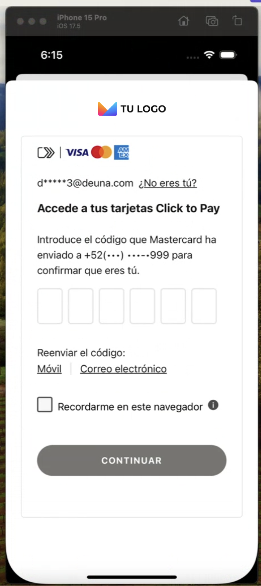
Click To Pay Widget
Make payments with Click to Pay using the types parameter of the initElements function.
TheuserInfoparameter is mandatory to be able to show the ClickToPay Widget.
        deunaSDK.initElements(
            callbacks: ElementsCallbacks(
                onSuccess: { data in
                },
                onError: { error in
                },
                onClosed: nil,
                onEventDispatch: { type, data in
                }
            ),
            userInfo: DeunaSDK.UserInfo(// required for Click To Pay
              firstName: "Esteban",
              lastName: "Posada",
              email: "[email protected]"
            ),
            types: [
                [
                    "name": ElementsWidget.clickToPay // PASS THIS FOR CLICK TO PAY
                ]
            ]
        )
2. Listen to Widget Events
It is crucial to properly handle Widget events to offer a smooth experience to users. Define the necessary callbacks to update your application interface.
Callbacks
| Callback | Modal | Embedded | When is it triggered? |
|---|---|---|---|
onSuccess | ✅ | ✅ | Executed when a card is saved successfully or when the Click to Pay payment was successful. This callback contains a parameter of type [String:Any] |
onError | ✅ | ✅ | Executed when an error occurs while processing the operation of the displayed widget. This callback contains a parameter of type ElementsError. |
onClosed | ✅ | ❌ | Executed when the payment widget is closed. This callback contains a parameter of enum typeCloseAction with the following values:
|
onEventDispatch | ✅ | ✅ | Executed when specific events are detected in the widget. This callback contains a parameter of type ElementsEvent and the data [String:Any] linked to the event. |
3. Close the widget
When the widget is shown in a modal, it only closes when the user presses the widget's close button or when they press the "back" button on iOS.
To close the modal when an operation is successful or when an error occurs, you must call the close function.
The following example code shows how to close the widget:
let callbacks = ElementsCallbacks(
  onSuccess: { response in
    self.deunaSDK.close() // Close the Vault Widget
    // Your additional code
  }
)

// Show the Vault Widget
deunaSDK.initElements(
  userToken = "<DEUNA user token>", // optional
  userInfo = DeunaSDK.UserInfo("Esteban", "Posada", "[email protected]"), // optional
  callbacks: callbacks
)
Optional features
In addition to the mandatory steps to operate the widget, you have the following customization options:
Customize widget appearance
Use the setCustomStyle function to customize the Widget appearance.
await DeunaSDK.setCustomStyle({...});
For more information, go to Style Customization.
Example
// Extension to convert a String to a Dictionary(JSON)
extension String {
    func toDictionary() -> [String: Any]? {
        guard let data = data(using: .utf8) else {
            return nil
        }
        do {
            let dictionary = try JSONSerialization.jsonObject(with: data, options: []) as? [String: Any]
            return dictionary
        } catch {
            print("Error: \(error.localizedDescription)")
            return nil
        }
    }
}

.
.
.
let callbacks = ElementsCallbacks(
  onSuccess: ...,
  onError: ...,
  onClosed: ...,
  onEventDispatch: { type, response in
    // Listen to events
           self.deunaSDK.setCustomStyle(data: """
                        {
                          "theme": {
                            "colors": {
                              "primaryTextColor": "#023047",
                              "backgroundSecondary": "#8ECAE6",
                              "backgroundPrimary": "#8ECAE6",
                              "buttonPrimaryFill": "#FFB703",
                              "buttonPrimaryHover": "#FFB703",
                              "buttonPrimaryText": "#000000",
                              "buttonPrimaryActive": "#FFB703"
                            }
                          },
                          "HeaderPattern": {
                            "overrides": {
                              "Logo": {
                                "props": {
                                  "url": "https://images-staging.getduna.com/ema/fc78ef09-ffc7-4d04-aec3-4c2a2023b336/test2.png"
                                }
                              }
                            }
                          }
                        }
                        """.toDictionary() ?? [:]
        )
  }
)
.
.
.

deunaSDK.initElements(
  userToken = "<DEUNA user token>", // optional
  userInfo = DeunaSDK.UserInfo("Esteban", "Posada", "[email protected]"), // optional
  callbacks: callbacks
)
Demo app
To better understand the Card vault integration, review the example project provided by DEUNA. This example will help you better understand how to implement the widget in your iOS application.
To access the example project and get more information, check the iOS Project Example documentation.
Hide pay button (embedded widget)
When the widget is shown embedded with the DeunaWidget view, you can hide the widget's pay button using the hidePayButton: true parameter.
DeunaWidget(
  deunaSDK: deunaSDK,
  configuration: ElementsWidgetConfiguration(
    hidePayButton: true // Set true to hide the pay button
    ...
  )
)
If DEUNA's widget pay button is hidden, then you must use the .isValid {} and .submit{} functions to complete the payment flow.
| Method | Description | Response |
|---|---|---|
deunaSdk.isValid{} | Validates if the entered information is correct and if the payment can be processed. | true if the information is valid, false otherwise. |
deunaSdk.submit{} | Executes the payment process, equivalent to pressing the pay button. Performs the same internal validations. | { status: "success", message: "Payment processed successfully" } or { status: "error", message: "The submit flow is not available" } |
Considerations:
- If
hidePayButtonisfalseor not defined, the pay button will be visible and the payment flow will work automatically. - If
hidePayButtonistrue, the pay button will not be shown and payment must be managed withsubmit{}. - It is recommended to use
isValid{}before callingsubmit{}to avoid errors in the payment process. - If the payment flow is not yet available,
submit{}will always return an error with the message"The submit flow is not available"