CustomStyle customization
Customize your DEUNA solutions using CustomStyle.
Customization is available for all widgets.
DEUNA allows you to visually adapt the checkout to align with your brand's visual identity. This guide describes how to configure the JSON file that controls widget styles, including colors, typography, borders, text, and specific views.
How customization works
- Define elements to customize: Identify the checkout views or components you want to change (buttons, fields, order summary, error messages, and so on).
- Configure the JSON file: Include the style values you want to apply. You can modify colors, typography, border radius, padding, and so on.
- Apply the configuration:
- For base widget styles, contact your TPM for implementation.
- For order-specific styles, you can include the style file within each order's tokenization.
Although the examples in the documentation are organized by section, the final configuration should be sent as a consolidated JSON file.
General scope
You can customize the following aspects:
- Checkout colors
- Typography
- Text, height, and radius of inputs and buttons
- Input border colors by state
- Enable text reset in inputs
- Enable iconographic validator in inputs
- Logo location and size
- Terms and Conditions
- Visual elements in specific views (such as OTP, cards, thank you page, billing data, and so on)
Global styles
Customize the global styles of your store.
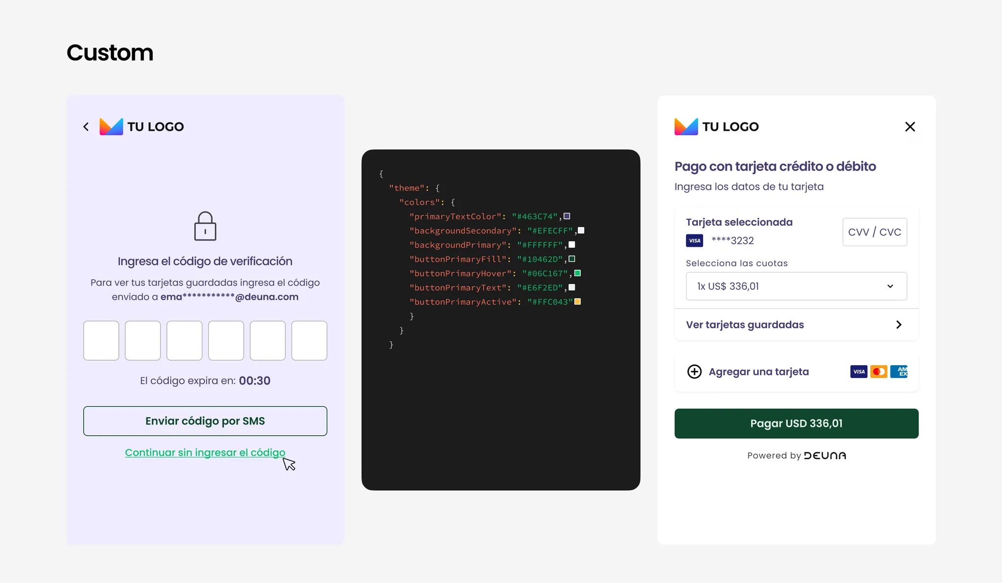
Color
You can define colors for:
- Background (primary/secondary)
- Main text
- Payment button (color, hover, text, active)
Colors must be defined in HEX format.
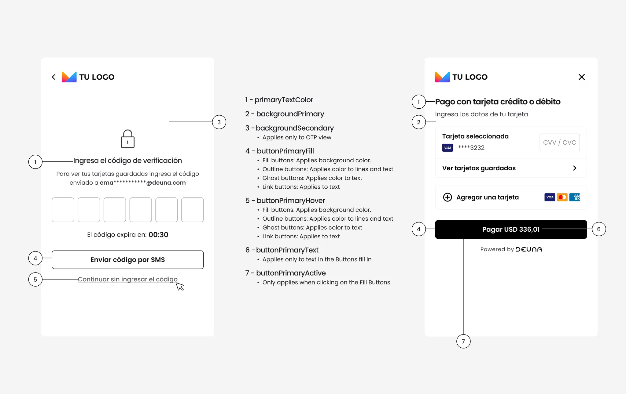
{
  "theme": {
    "colors": {
      "primaryTextColor": "#323237",
      "backgroundSecondary": "#FFFFFF",
      "backgroundPrimary": "#FFFFFF",
      "buttonPrimaryFill": "#17171A",
      "buttonPrimaryHover": "#69696E",
      "buttonPrimaryText": "#FFFFFF",
      "buttonPrimaryActive": "#5F529E"
    }
  }
}
Typography
You can choose from the following compatible typefaces:
-
Heeb
-
Hind
-
Lato
-
Montserrat
-
Mukta
-
Nunito
-
Open Sans
-
Quicksand
-
Roboto
-
Raleway
-
San Francisco
-
Ubuntu
If you want to use a different typeface, then contact your TPM.
{
  "theme": {
    "typography": {
      "primaryFontFamily": "Lato"
    }
  }
}
Example:
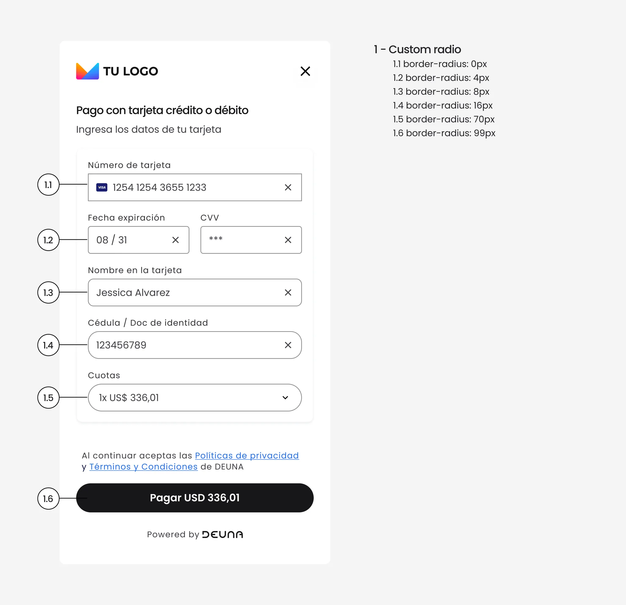
Input and button radius
You can define the border-radius in pixels for inputs and buttons:
{
  "theme": {
    "inputs": {
      "borderRadius": "50px"
    },
    "buttons": {
      "borderRadius": "20px"
    }
  }
}
Input and button height
You can define a custom height for inputs and buttons. By default, the height is 40px.
For a better user experience, use a minimum height of 30px and maximum of 60px.
{
  "theme": {
    "buttons": {
      "borderRadius": "20px",
      "heigh": "50px"
    },
    "inputs": {
      "borderRadius": "90px",
      "height": "50px"
    }
  }
}
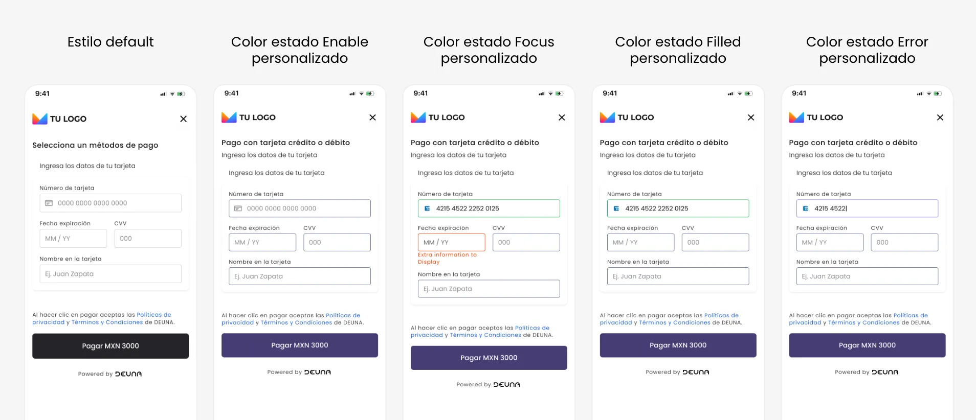
Input border colors by state
You can select a specific border color for inputs depending on their state.
| State | Definition | Default color |
|---|---|---|
Disabled | The input is not enabled for the user, therefore they cannot write in the input. | # B4B4B7 |
Enabled | The input is enabled, but has not been focused yet or the user has not written anything. | # D9D9DB |
Focus | The user is typing or has focus on the input. | # 404046 |
Filled | The input has been completed with valid data. | # 8E8E92 |
Error | The input contains validation errors or is incomplete when it's required. | # E11900 |
For a clear user experience, use a red color for theErrorstate.
 theme: {
    colors: {
    inputBorder: '#D9D9DB', // Default state (enabled)
    inputBorderError: '#F1998E', // Error state
    inputEnhancerFill: '#1AE1D7', // Active state (focus)
    inputBorderPositive: '#66D19E', // Success state
    },
  },
Enable text reset in inputs
You can place a reset button in all text fields. By default, this setting is off. It acts as a shortcut to clear all text from the field without holding backspace.
 theme: {
    inputs: {
      inputMode: 'clearable' // 'validated' | 'clearable' | 'none'
    },
  },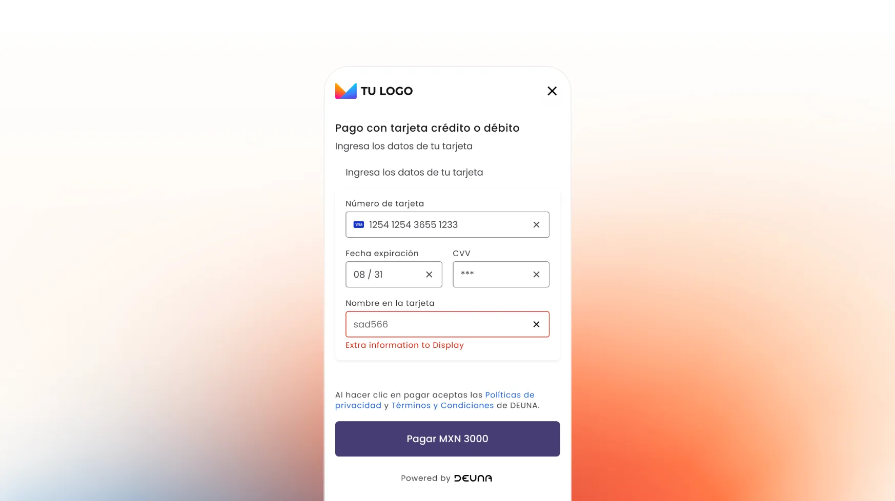
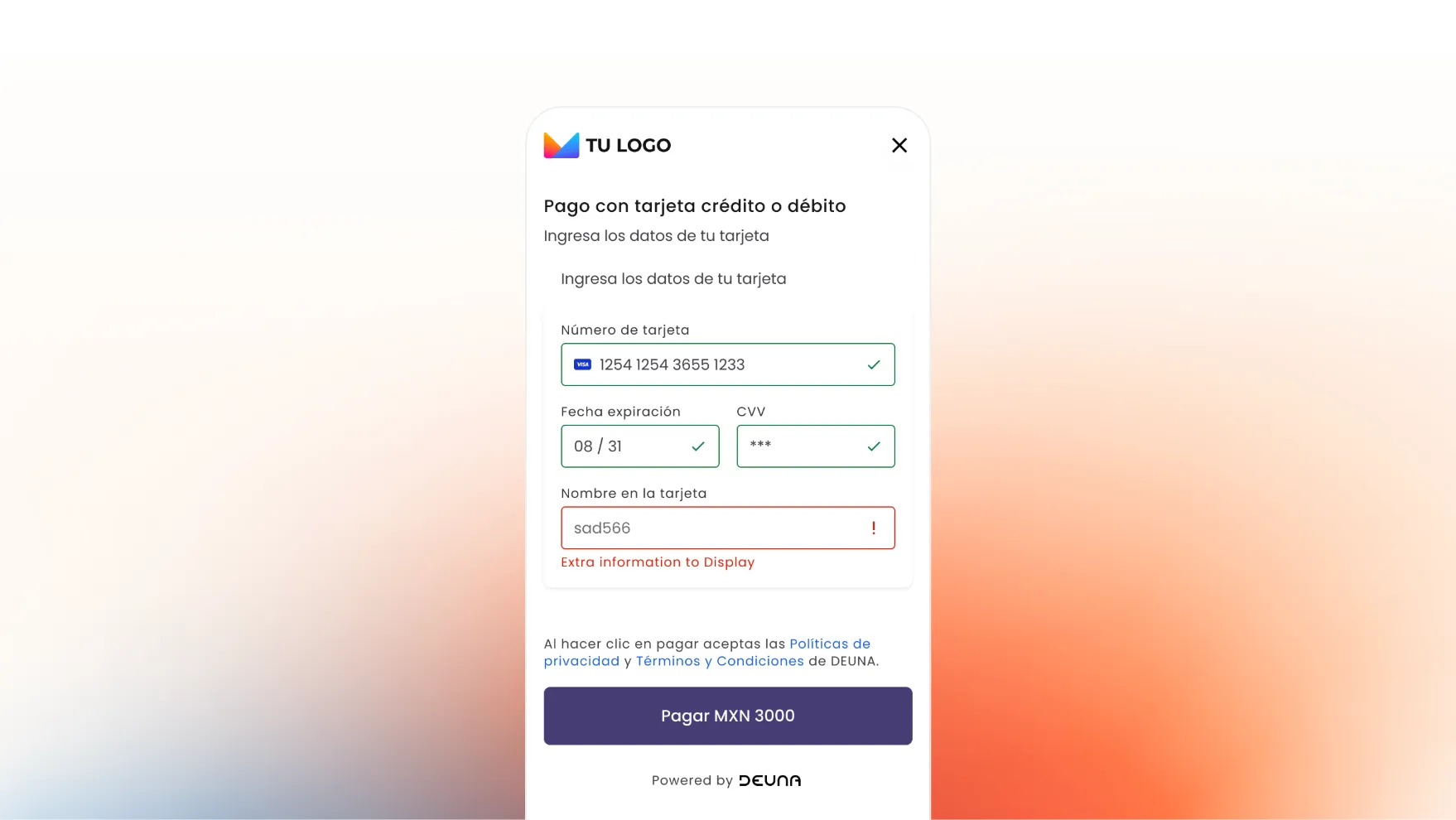
Enable iconographic validator in text inputs
You can enable an iconographic validator in text inputs. By default, this setting is off. It consists of an icon inside the input, aligned to the right, depending on the state:
- Filled: Check ✅
- Error: Exclamation ❗️
You cannot enable text reset and iconographic validator at the same time.
 theme: {
    inputs: {
      inputMode: 'validated' // 'validated' | 'clearable' | 'none'
    },
  }
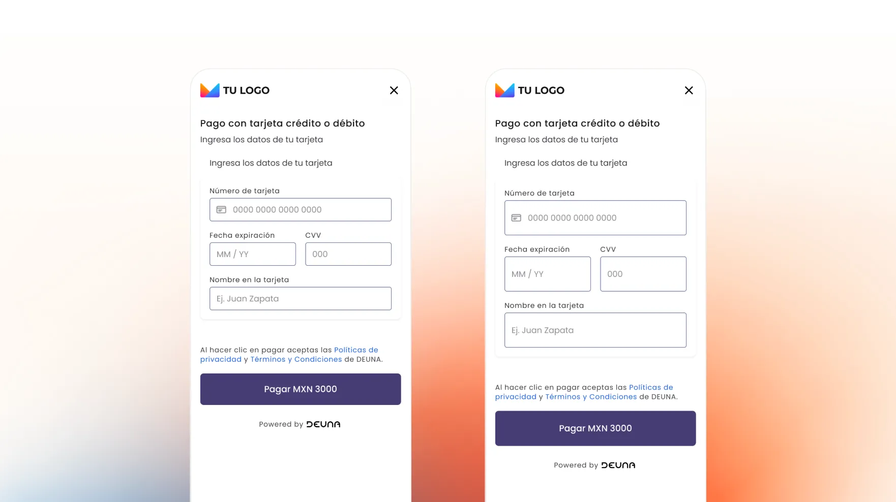
Merchant logo
Refers to available configurations for the logo
- Change logo
- Change logo location: center or left
- Change logo size
Default: 100px logo located on the left of the widget
{
  "HeaderPattern": {
    "overrides": {
      "Logo": {
        "props": {
          "url": "https://host.com/custom_logo.png",
          "position": "center",
          "style": {
            "min-width": "150px"
          }
        }
      }
    }
  }
}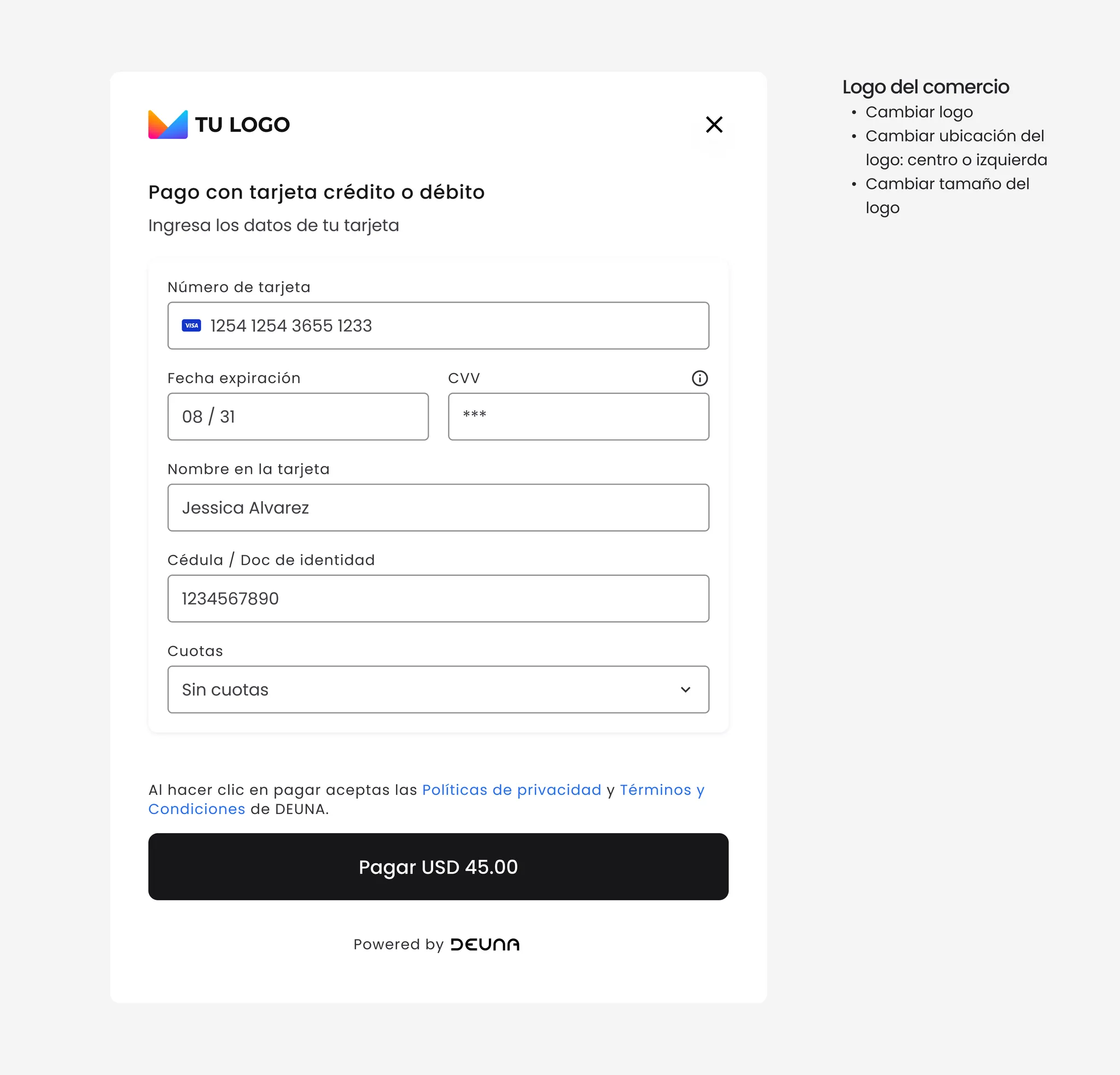
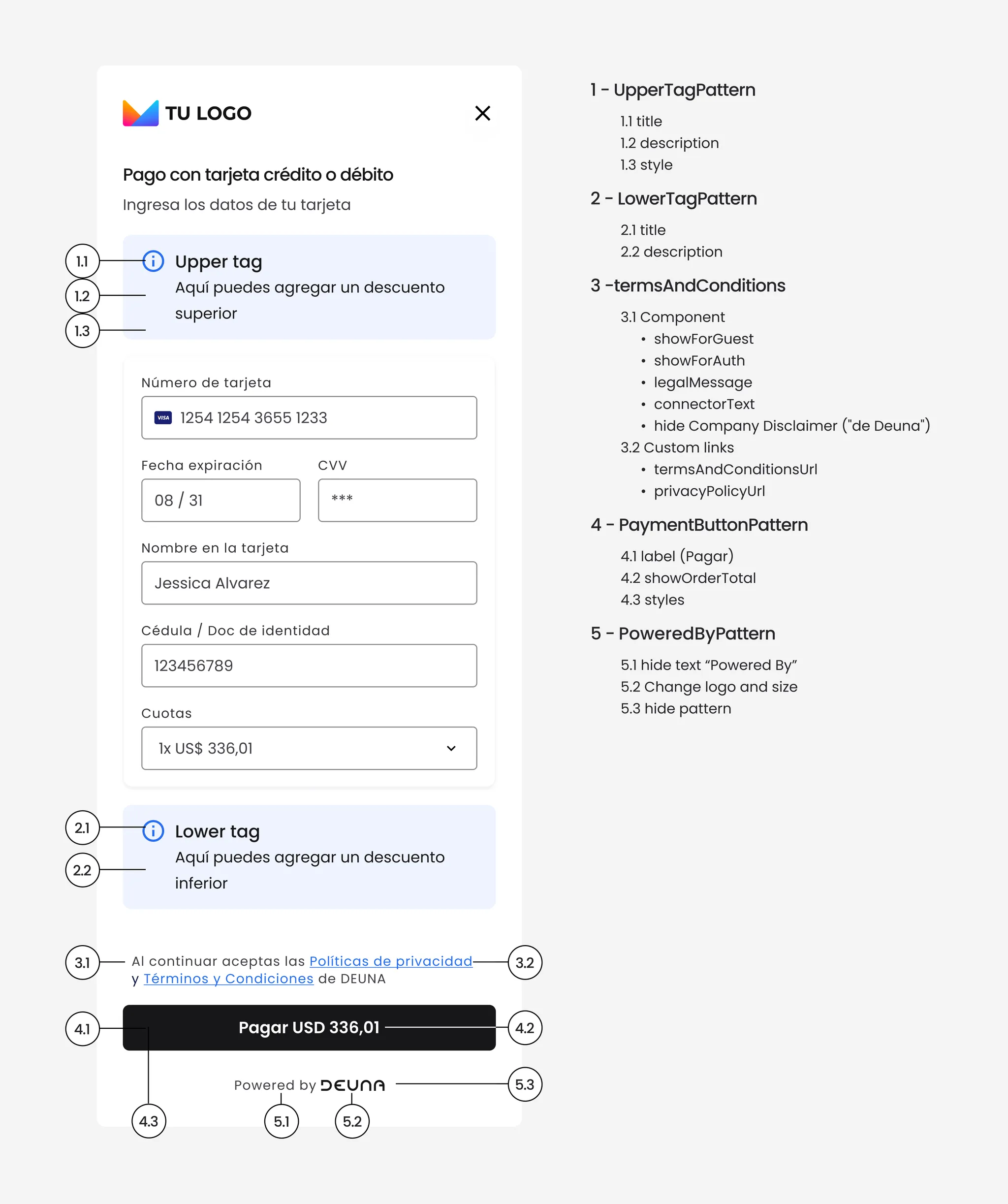
Terms & Conditions
With this configuration, et up the legal texts and links that appear at the bottom of a screen or form such as “By continuing, you accept our Terms and Conditions...”.
{
  "TermsConditionsPattern": {
    // Hide terms for non authenticated users //  Muestra términos para usuarios invitados (no autenticados)
    "showForGuest": true,

    // Hide terms for authenticated users // Oculta términos para usuarios autenticados (ya los aceptaron al registrarse)
    "showForAuth": false,

    // Legal message in HTML // Mensaje legal personalizado con HTML. Sobrescribe el texto por defecto traducido.
    // If used, the inline links replace the <A> patterns // Si usas esto, los links inline reemplazan los componentes <A> del patrón
    "legalMessage": "Al continuar, aceptás nuestros <a href='https://tusitio.com/terminos-y-condiciones'>Términos y Condiciones</a> y nuestra <a href='https://tusitio.com/politica-de-privacidad'>Política de Privacidad</a>.",

    // Connector texts between Privacy Polcy and Terms & Conditions // Texto conector entre "Política de Privacidad" y "Términos y Condiciones"
    // Overides the default translation (t('andThe')) // Sobrescribe la traducción por defecto (t('andThe'))
    "connectorText": "y",

    // Hides the  [Brand] sufix // Oculta el sufijo "de [Marca]" al final del disclaimer
    "hideCompanyDisclaimer": true,

    // Terms PDF/page URL. Fallbac URLs are preset by default by country of merchant // URL del PDF/página de términos. Fallback: URLs por defecto según país del merchant
    "termsAndConditionsUrl": "http://static.cinepolis.com/resources/pe/documents/terminos-y-condiciones.pdf",

    // Privacy policy PDF/page URL. Fallbac URLs are preset by default by country of merchant // URL del PDF/página de política de privacidad. Fallback: URLs por defecto según país
    "privacyPolicyUrl": "http://static.cinepolis.com/resources/pe/documents/politica-de-privacidad.pdf",

    // Changes the behaviour: shows explicit acceptance checkout // CAMBIA COMPLETAMENTE EL COMPORTAMIENTO: muestra checkbox de aceptación explícita
    // Only supported by Click to Pay // Solo soportado para Click to Pay. Estado guardado en UserContext.hasAcceptedTermsAndConditions
    // For Click to Pay // Para Click to Pay, si es false, NO VAMOS A MOSTRAR NINGÚN TIPO DE TYC.
    "requiresAcceptance": true,

    // Click to pay terms & conditions  URL // Url para los terminos y condiciones propias de click to pay.
  },

  "LegalInfoPattern": {
    // Hides the "Powered by dLocal" legal footer // Oculta el logo "Powered by dLocal" del footer legal
    "hidePoweredBy": true
  },

  "PoweredByPattern": {
    // Customized image URL //  URL de imagen personalizada para reemplazar el logo de dLocal
    "url": "https://1000logos.net/wp-content/uploads/2021/05/Coca-Cola-logo.png",

    // Inline CSS styles for custom image // Estilos CSS inline para la imagen personalizada
    "imageStyle": {
      "width": "50px",
      "height": "200px"
    },
  }
}
Customizations by section
Customize sections of your solution.
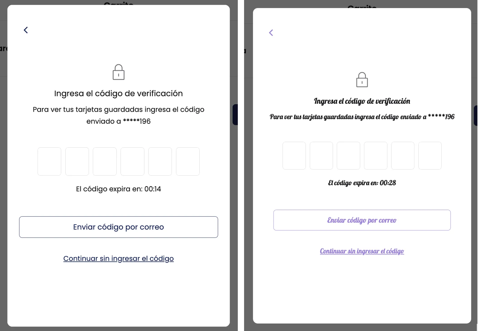
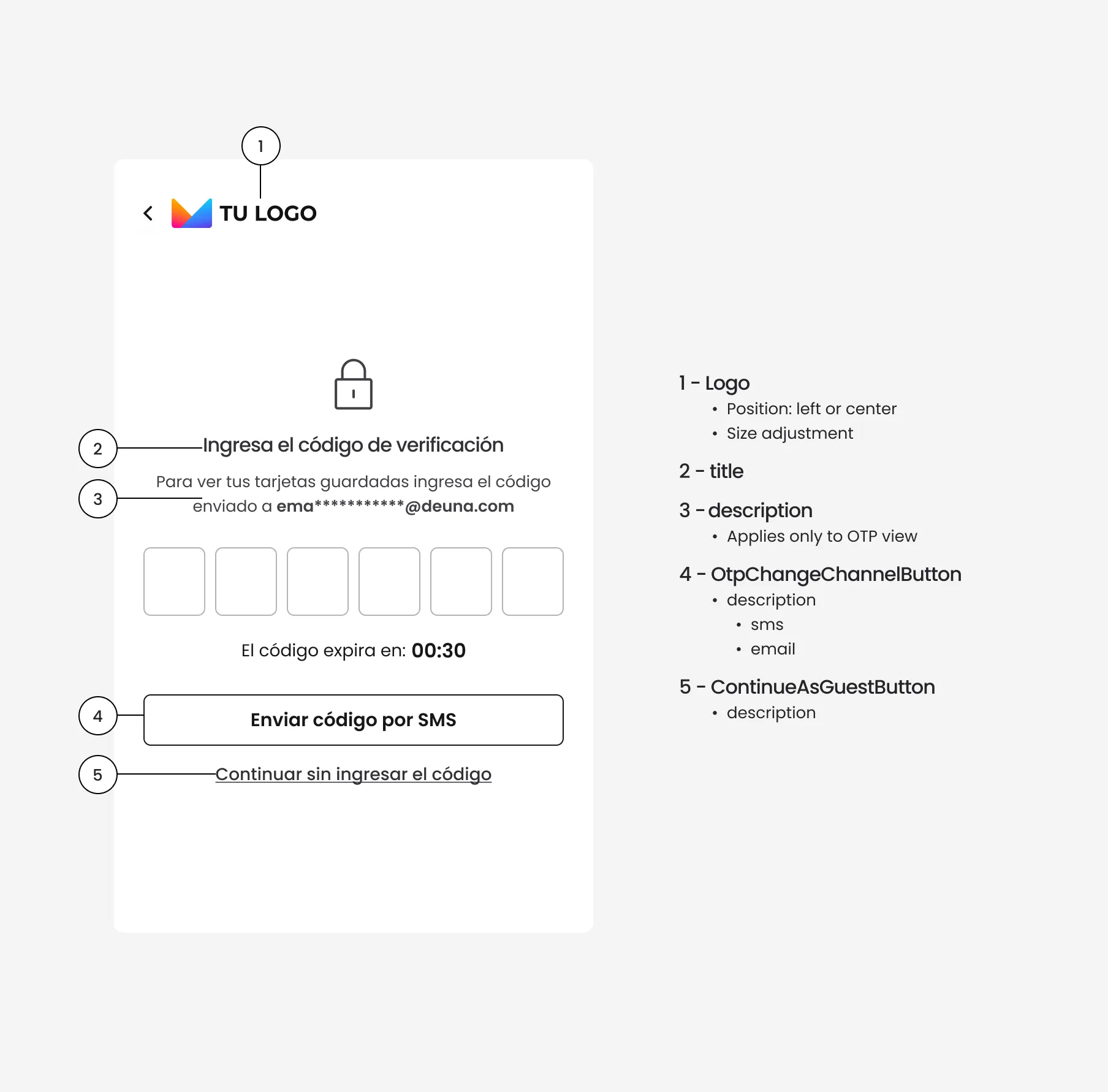
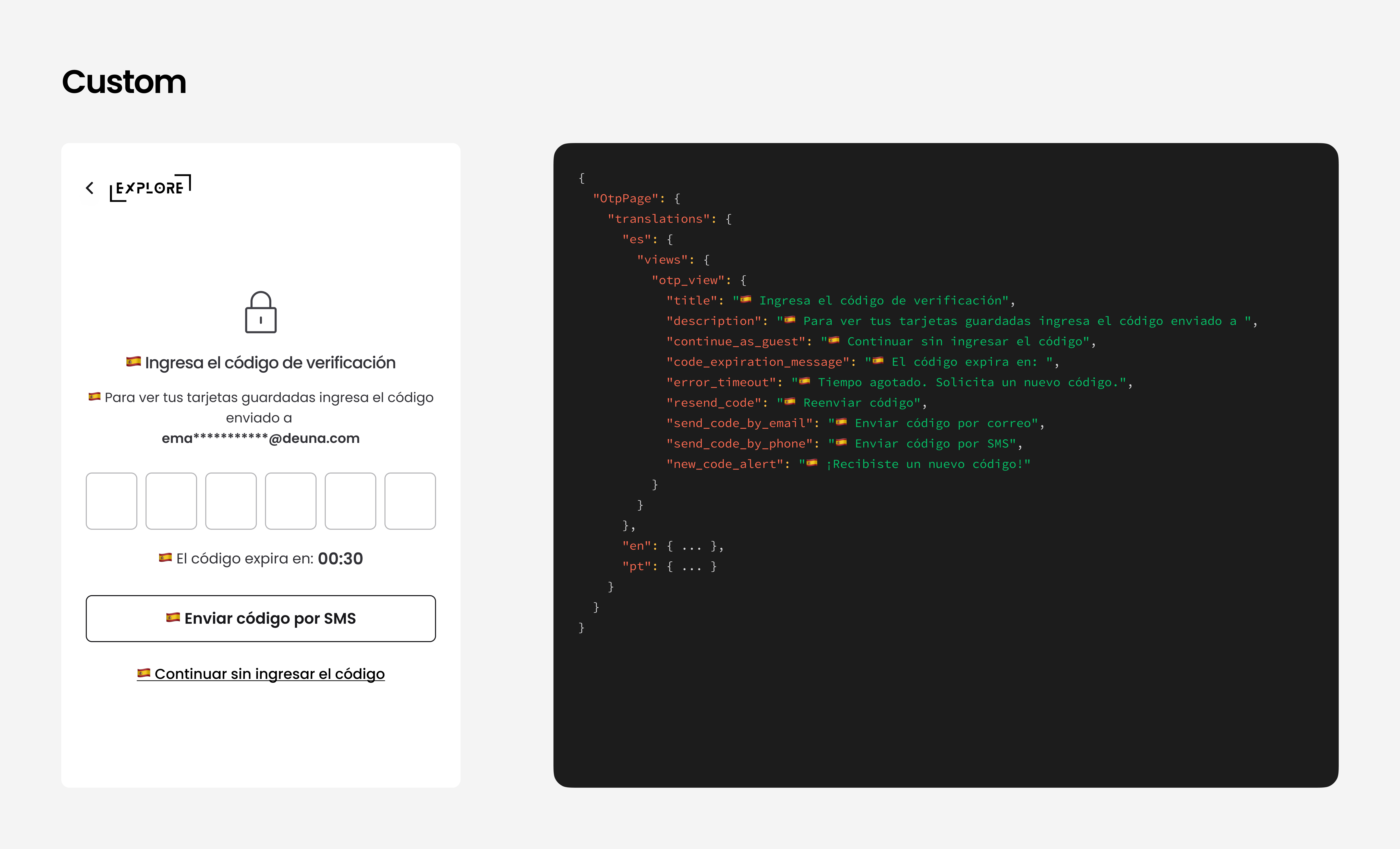
Verification code view
This view appears when it's required for the user to validate their identity through a one-time password code sent by email. It's part of the authentication flow.
The verification view is optional.
Customize:
- Header
- Channel change buttons (SMS/email)
- "Continue as guest" option
{
  "OtpPage": {
    "translations": {
      "es": {
        "views": {
          "otp_view": {
            "title": "🇪🇸 Ingresa el código de verificación",
            "description": "🇪🇸 Para ver tus tarjetas guardadas ingresa el código enviado a ",
            "continue_as_guest": "🇪🇸 Continuar sin ingresar el código",
            "code_expiration_message": "🇪🇸 El código expira en: ",
            "error_timeout": "🇪🇸 Tiempo agotado. Solicita un nuevo código.",
            "resend_code": "🇪🇸 Reenviar código",
            "send_code_by_email": "🇪🇸 Enviar código por correo",
            "send_code_by_phone": "🇪🇸 Enviar código por SMS",
            "new_code_alert": "🇪🇸 ¡Recibiste un nuevo código!"
          }
        }
      },
      "en": { ... },
      "pt": { ... }
    }
  }
}
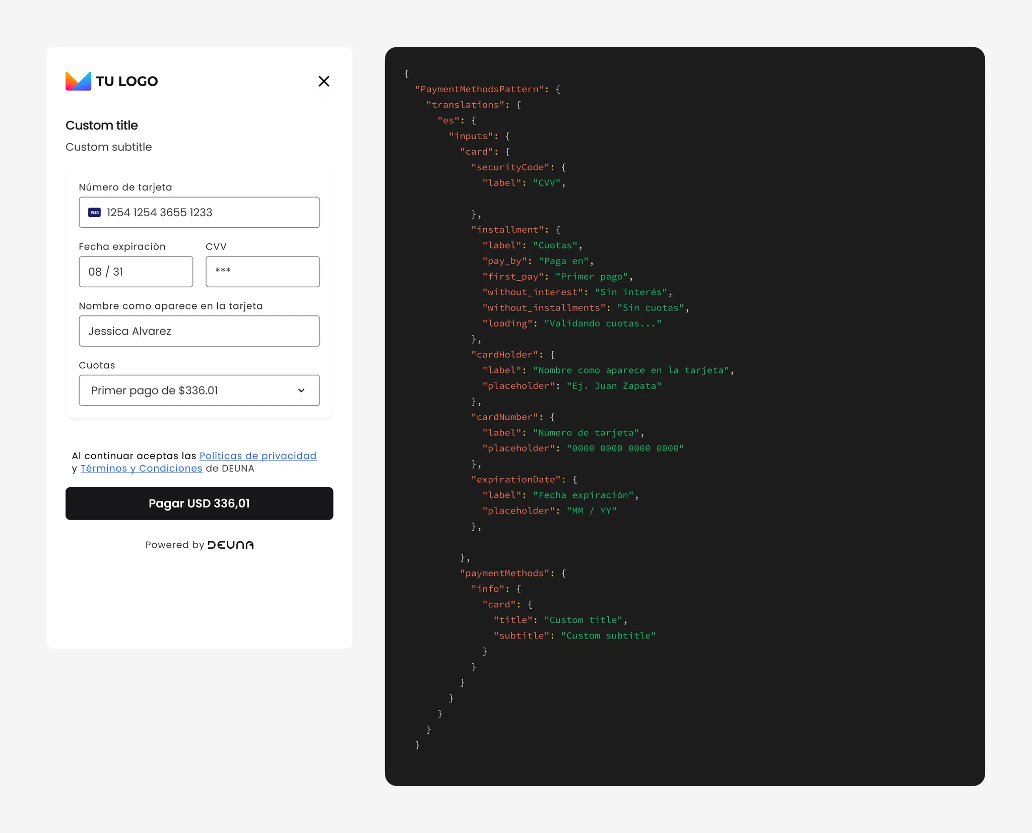
Card payment view
Corresponds to the main form where the user enters their card details to complete the purchase.
Customize:
- Section titles and subtitles: edit or hide texts
- Field labels (such as card number, name, and installments)
- Payment button text
- UpperTag / LowerTag informational notices (not available on Payment Link).
- Legal messages and links to terms and conditions
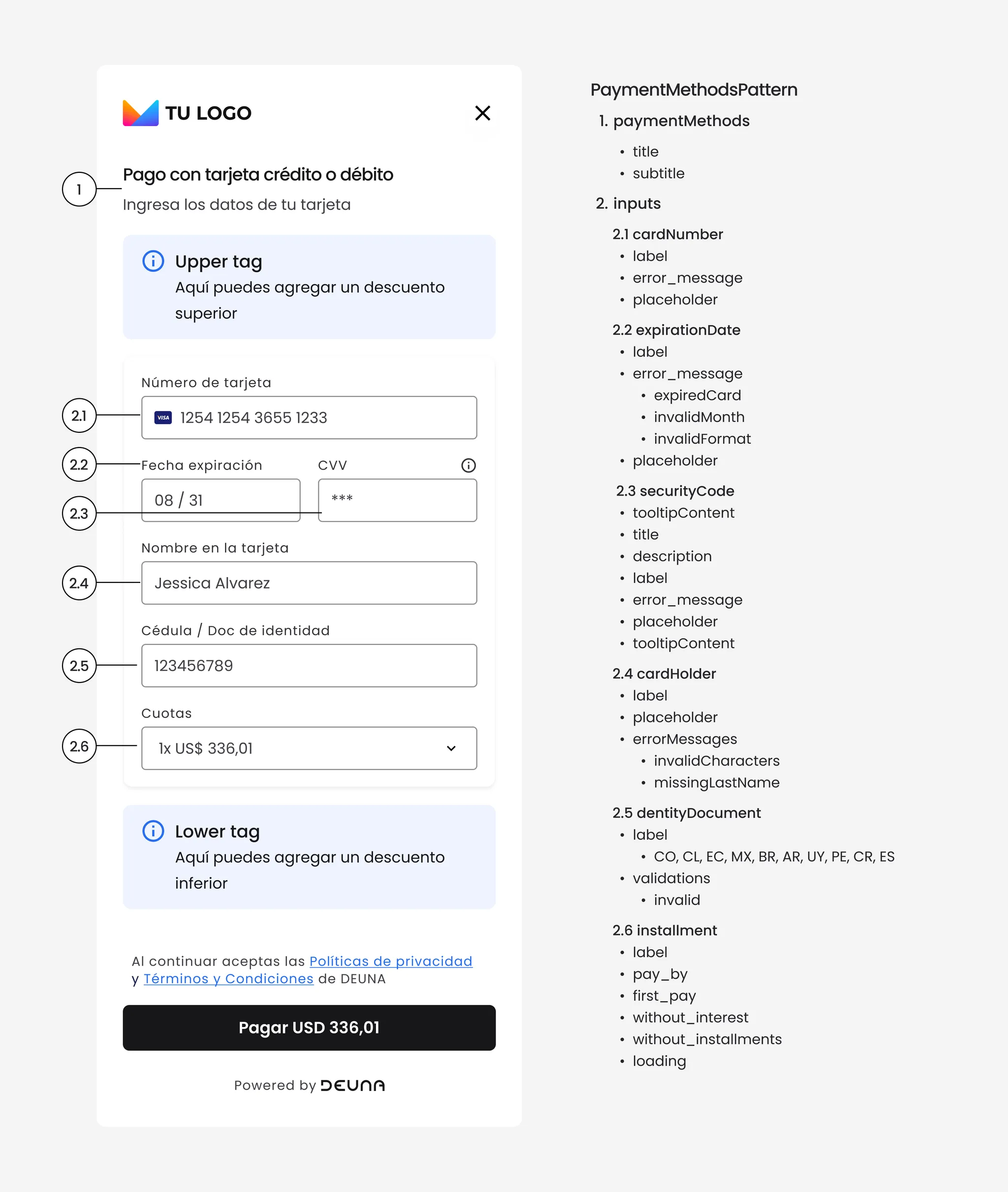
{
  "PaymentMethodsPattern": {
    "translations": {
      "es": {
        "inputs": {
          "card": {
            "securityCode": {
              "label": "CVV"
            },
            "installment": {
              "label": "Cuotas",
              "pay_by": "Paga en",
              "first_pay": "Primer pago",
              "without_interest": "Sin interés ",
              "without_installments": "Sin cuotas",
              "loading": "Validando cuotas..."
            },
            "cardHolder": {
              "label": "Nombre como aparece en la tarjeta",
              "placeholder": "Ej. Juan Zapata"
            },
            "cardNumber": {
              "label": "Número de tarjeta",
              "placeholder": "0000 0000 0000 0000"
            },
            "expirationDate": {
              "label": "Fecha expiración",
              "placeholder": "MM / YY"
            }
          }
        },
        "paymentMethods": {
          "info": {
            "card": {
              "title": "tarjeta crédito o débito",
              "subtitle": "Por favor, ingresa los datos de tu tarjeta"
            }
          }
        }
      },
      "en": {...},
      "pt": {...}
    },
    "props": {
      "hideTitleForCreditCard": true
    }
  }
}
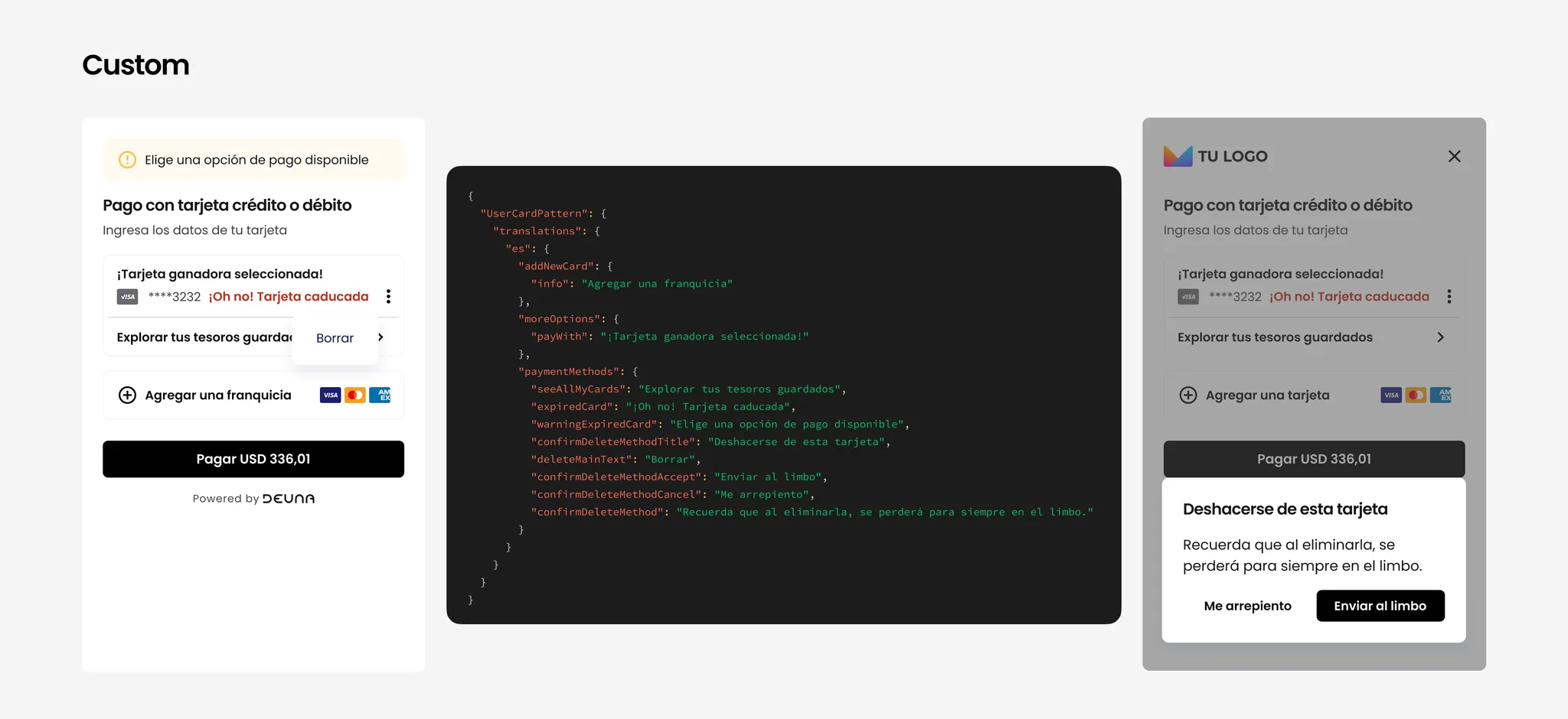
Saved cards view (authenticated users)
Shown when an authenticated user has previously stored cards and can choose between them to complete their purchase.
You can customize:
- Button texts
- Expiration messages or warnings
- Deletion confirmation
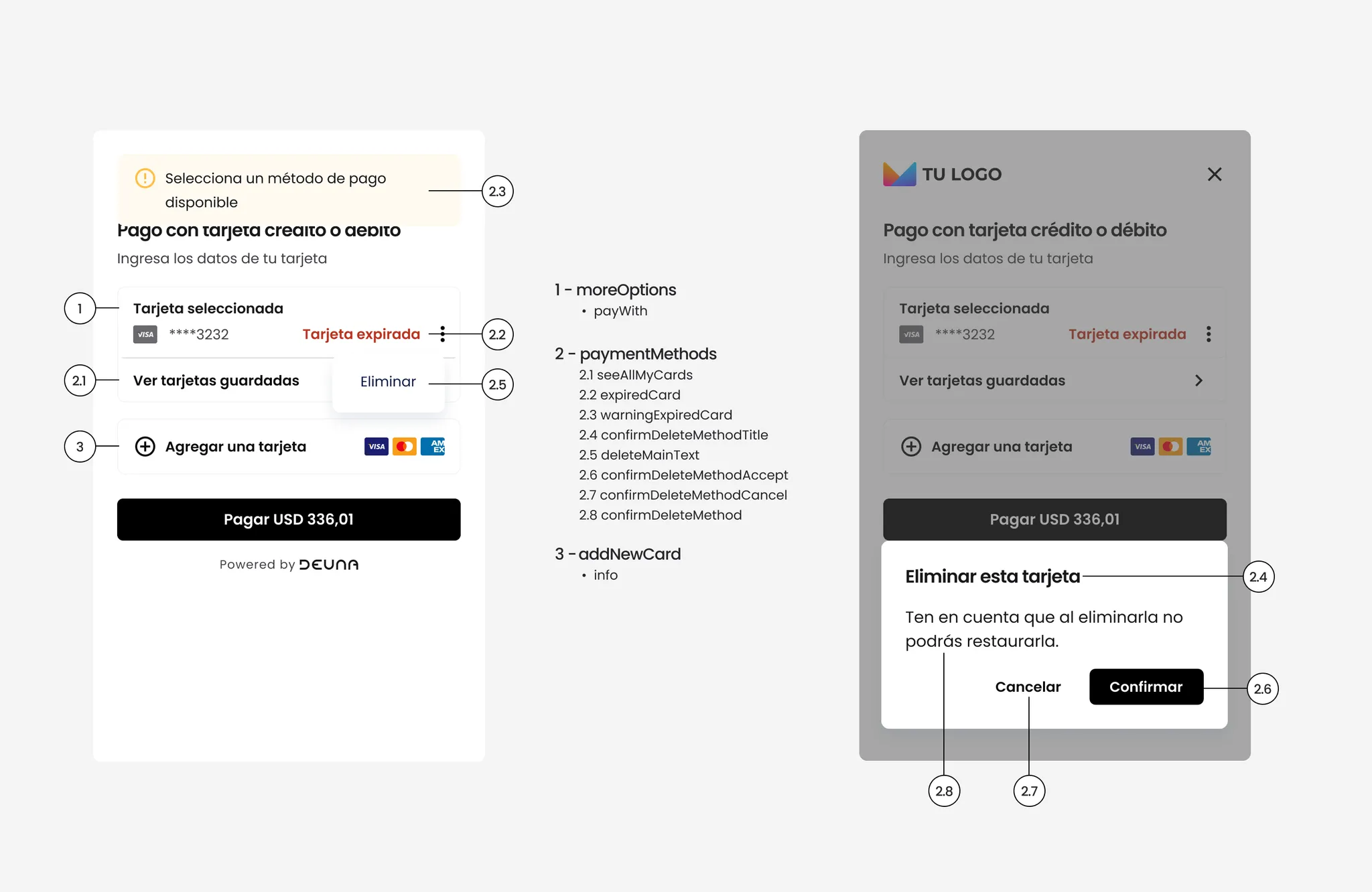
{
  "UserCardPattern": {
    "translations": {
      "es": {
        "addNewCard": {
          "info": "Add a card"
        },
        "moreOptions": {
          "payWith": "Selected card"
        },
        "paymentMethods": {
          "expiredCard": "Expired card",
          "confirmDeleteMethodTitle": "Delete this card",
          "confirmDeleteMethod": "Please note that once deleted, you won't be able to restore it."
        }
      },
      "en": {...},
      "pt": {...}
    }
  }
}
Thank you page
Purchase confirmation screen that appears at the end of the process if not redirected to another site.
You can customize:
- Thank you title
- Order statuses (
succeeded,pending,denied) - Button text: "Save receipt", "Back to store"
{
  "ThankYouView": {
    "translations": {
      "es": {
        "thankYouPage": {
          "title": "🇪🇸 Gracias por tu compra",
          "status": {
            "succeeded": "🇪🇸 ¡Gracias por tu compra!",
            "pending": "🇪🇸 Procesando...",
            "denied": "🇪🇸 Pago rechazado"
          },
          "downloadVoucher": "🇪🇸 Descargar comprobante",
          "backToCommerce": "🇪🇸 Volver a la tienda"
        }
      },
      "en": {...},
      "pt": {...}
    },
    "overrides": {
      "Actions": {
        "props": {
          "hideDownloadAction": false,
          "hideBackToCommerceAction": false
        }
      }
    }
  }
}
Example:
Voucher page
Instruction screen for payments with alternative methods (for example, cash payments or transfers).
You can customize:
-
Title, subtitle, description
-
Reference messages and payment deadline
-
Button text
-
Show/hide DEUNA branding
Configure your JSON with one of the following payment processor identifiers:
- SPEI
- OXXO_PAY
- OXXO_REFERENCE
- PAYU_EFECTY
- BAZ_REFERENCE
- SPEI_OPENPAY
- SPEI_OPM
- SAFETY_PAY
- STP_CODI
- PIX
Replace [PROCESSOR_NAME] in your JSON configuration with one of the values listed above.
OXXO Example:
{
  "VoucherPage": {
    "[PROCESSOR_NAME]": {
      "es": {
        "overrides": {
          "Header": {
            "props": {
              "title": "🇪🇸 Comprobante de Pago PIX",
              "subtitle": "🇪🇸 Tu transacción fue procesada exitosamente"
            }
          },
          "Footer": {
            "props": {
              "downloadReference": "🇪🇸 Descargar Comprobante",
              "showPoweredByDeuna": false
            }
          }
        }
      },
      "en": { ... },
      "pt": { ... }
    },
    "[PROCESSOR_NAME]": {
      "es": { ... },
      "en": { ... },
      "pt": { ... }
    }
  }
}
User information view
Initial form where basic buyer data is requested, such as name, email, phone, and identity document. This view is optional and only available for payment link and full checkout.
Allows customizing fields related to:
- Section title
- Labels for all fields
{
  "UserInfoPattern": {
    "translations": {
      "es": {
    		"title": "Title custom style",
        "inputs": {
          "email": { "label": "email style" },
          "firstName": { "label": "label style" },
          "lastName": { "label": "lastName style" },
          "phone": { "label": "phone style" },
          "identityDocument": {
            "label": {
              "CO": "Cédula / Doc de identidad",
              "CL": "RUT/DNI",
              "EC": "Cédula / Doc de identidad",
              "MX": "Número de RFC",
              "BR": "Registro Geral",
              "AR": "DNI / Doc de identidad",
              "UY": "Cédula / Doc de identidad"
            }
          }
        }
      },
      "en": {...},
      "pt": {...}
    }
  }
}
Billing data view
Form to capture billing data, if required by the merchant or regulation. It's an optional view available in the payment link, Payment widget, and full Checkout widget.
Allows customizing:
- Section title
- Labels for all fields
See the properties described in the JSON file below:
"BillingPatternX": {
    "translations": {
      "es": {
        "addBillingData": {
          "error": "Debes ingresara los datos de facturación para continuar. ✅",
          "optionalTag": "No obligatorio",
          "title": "Añadir información"
        },
        "billingSummary": {
          "dni": "Documento",
          "update": "Modificar"
        },
        "billingView": {
          "cancel": "Anula",
          "save": "Guardar cambios",
          "title": "Introduce tu información de facturación"
        },
        "billingWithSameData": {
          "title": "Usar los mismos datos de facturación"
        },
        "inputs": {
          "companyBilling": {
            "activity": {
              "label": "Giro/Actividad"
            },
            "address": {
              "label": "Domicilio fiscal"
            },
            "authorizingFirstName": {
              "label": "Nombre del responsable"
            },
            "authorizingIdentityDocument": {
              "label": "Identificación del responsable"
            },
            "authorizingLastName": {
              "label": "Apellido del responsable"
            },
            "city": {
              "label": "Localidad"
            },
            "email": {
              "label": "Correo electrónico"
            },
            "identityDocument": {
              "label": "Registro fiscal"
            },
            "label": "Entidad jurídica",
            "name": {
              "label": "Razón social"
            },
            "phone": {
              "label": "Teléfono de contacto"
            }
          },
          "errors": {
            "identityDocument": "Número de CPF o CNPJ incorrecto",
            "inputRequired": "Campo obligatorio",
            "invalidEmail": "Email inválido",
            "invalidZipcode": "Código postal incorrecto",
            "phoneInvalid": "Teléfono no válido"
          },
          "personBilling": {
            "additionalDescription": {
              "label": "Zona/Barrio"
            },
            "address1": {
              "label": "Domicilio"
            },
            "address2": {
              "label": "Piso / Depto / Torre"
            },
            "city": {
              "label1": "Localidad",
              "label2": "Municipio",
              "label3": "Localidad/Municipio"
            },
            "country": {
              "label": "Nación",
              "placeholder": "Selecciona tu nación"
            },
            "email": {
              "label": "Email"
            },
            "firstName": {
              "label": "Nombre propia"
            },
            "identityDocument": {
              "errorMessage": "Debe ser un documento de identidad válido.",
              "invalidByCountry": {
                "AR": "DNI o identificación incorrecta",
                "BR": "CPF o CNPJ inválido",
                "CL": "RUT o DNI incorrecto",
                "CO": "Cédula no válida",
                "EC": "Cédula no válida",
                "MX": "RFC incorrecto",
                "UY": "Cédula no válida"
              },
              "label": "Identificacións"
            },
            "label": "Persona física",
            "lastName": {
              "label": "Apellido familiar"
            },
            "phone": {
              "label": "Número telefónico"
            },
            "stateName": {
              "label1": "Provincia",
              "label2": "Departamento",
              "placeholder": "Elige una provincia",
              "placeholder2": "Elige un departamento"
            },
            "zipCode": {
              "lbel": "Código postal"
            }
          }
        },
        "title": "Dirección de la tarjeta"
      }
Split Payment Page
Allows the customer to split the total order value between two carts. Ideal for high-value purchases or if the user wants to use more than one payment method, this is a dedicated feature for Vault.
Allows customizing:
- Header Labels
- Card Label Form
- "Amount to Pay" Label
- "Total Amount to Pay" Label
- Button Text
- Second Card Billing Labels
- Summary Label
{
  "SplitPaymentPage": {
    "translations": {
      "es": {
        "stepper": {
          "backToSinglePayment": "Custom Style text",
          "label": "Custom Style text"
        },
        "common": {
          "enterCardDataLabel": "Custom Style text",
          "totalAmontLabel": "Custom Style text"
        },
        "amountToPayCard": {
          "title": "Custom Style text"
        },
        "footerButton": {
          "goToCard2": "Custom Style text",
          "goToPurchase": "Custom Style text"
        },
        "useSameBillingCheckbox": {
          "label": "Custom Style text"
        },
        "billingSection": {
          "title": "Custom Style text %{ordinal}"
        },
        "lastStep": {
          "title": "Custom Style text"
        }
      }
    }
  }
}
Example
IMPORTANT: The billingSection > title text personalization includes the %{ordinal} interpolation variable. This variable dynamically displays the current card step (e.g., "Second," "Third," etc.). You must retain this variable in the custom text to prevent incorrect labels from being displayed.
Example:
{
  "SplitPaymentPage": {
    "translations": {
      "es": {
        "billingSection": {
          "title": "Datos Fact. %{ordinal} tarjeta"
        },
      }
    }
  }
}
Installments
This message appears when you enter a card whose BIN (Bank Identification Number) is not eligible for installment payments.
Allows customizing:
- Label text
- Tooltip text
- List items explaining why interest-free installments do not apply
- Tooltip styles (colors, padding, etc.)
{
  "InstallmentsPattern": {
    "overrides": {
      "NoInstallmentsTooltip": {
        "label": "¿Por qué no puedo pagar a meses sin intereses?",
        "popoverProps": {
          "title": "¿Por qué no puedo pagar a MSI?",
          "list": [
            "Tu compra es menor a $2,500",
            "Tu tarjeta es de débito",
            "Tu banco no es participante",
            "Los productos no son aplicables a la promoción MSI"
          ],
          "listType": "unordered",
          "textColor": "red",
          "styles": {
            "padding": "16px",
            "backgroundColor": "blue"
          }
        }
      }
    }
  }
}
Why are there two styles keys?
- The top-level one is responsible for adding styles to the label container and the tooltip icon.
- The one inside popoverProps is responsible for adding styles to the popover tooltip container.
Example:
Redirect Page
It allows the customer to view the payment status after completing the challenge of an APM, such as the one for 3DS.
Allows customizing:
- Message Information
- Status text
- Progress Bar text
{
  "PurchaseStatusView": {
    "translations": {
      "pt": {
        "purchaseStatus": {
          "info": {
            "processed": "Processado Info PT - ☸",
            "cancelled": "Pagamento cancelado PT - ☸",
            "pending": "Pendente PT - ☸",
            "pending_3ds": "Pendente 3DS PT - ☸",
            "denied": "Negado PT - ☸"
          },
          "message": {
            "processed": "message Processado PT - ☸",
            "cancelled": "message Cancelado PT - ☸",
            "pending": "message Pendente PT - ☸",
            "pending_3ds": "message Pendente 3DS PT - ☸",
            "denied": "message Negado PT - ☸"
          },
          "redirecting": "Redirecionando PT"
        }
      }
    }
  }
}
Example:
Updated 2 months ago