Payment links customization
Customize your payment link implementation.
Contact your DEUNA TPM to apply any of these settings.
Logo, primary color, and language
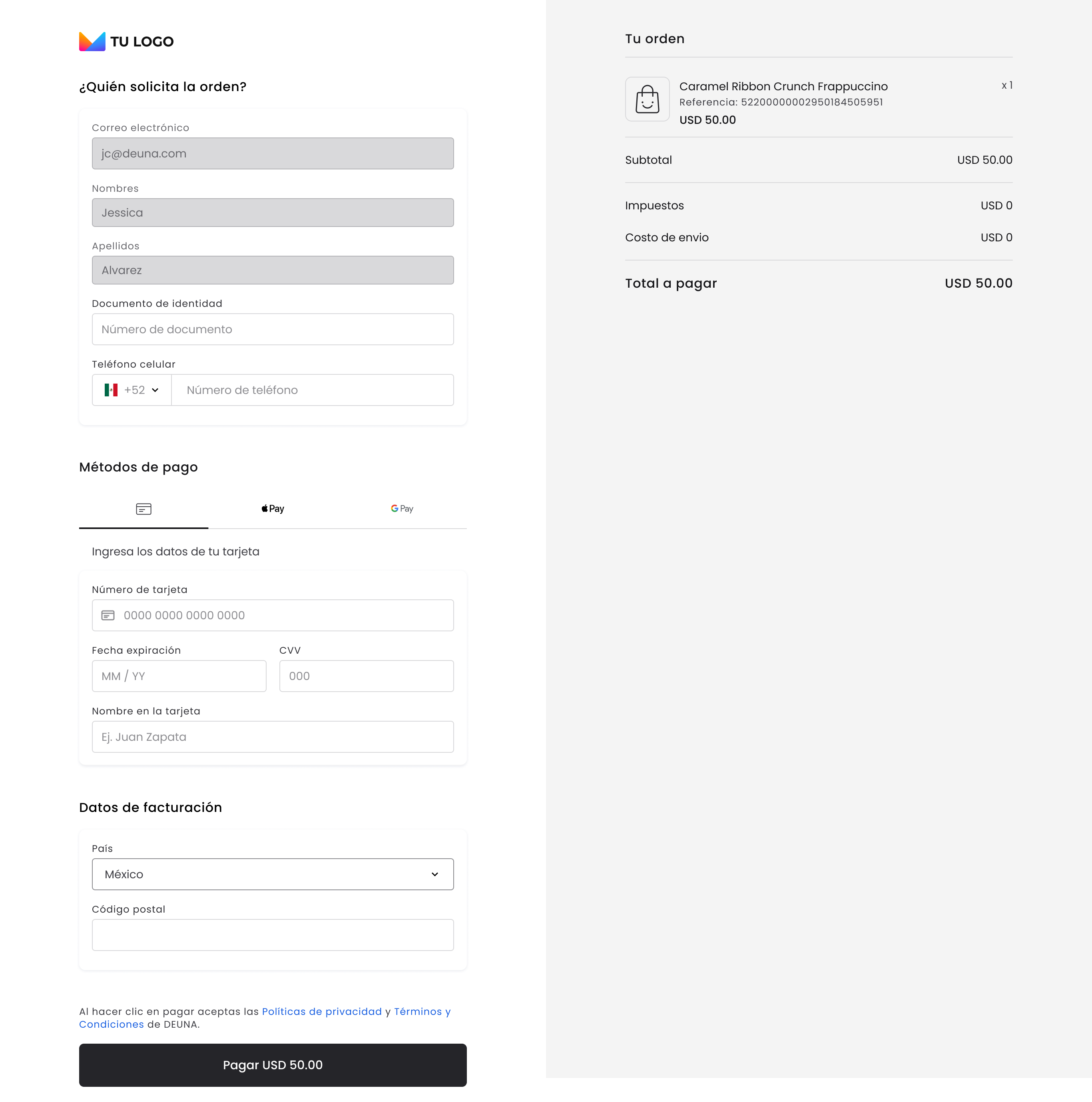
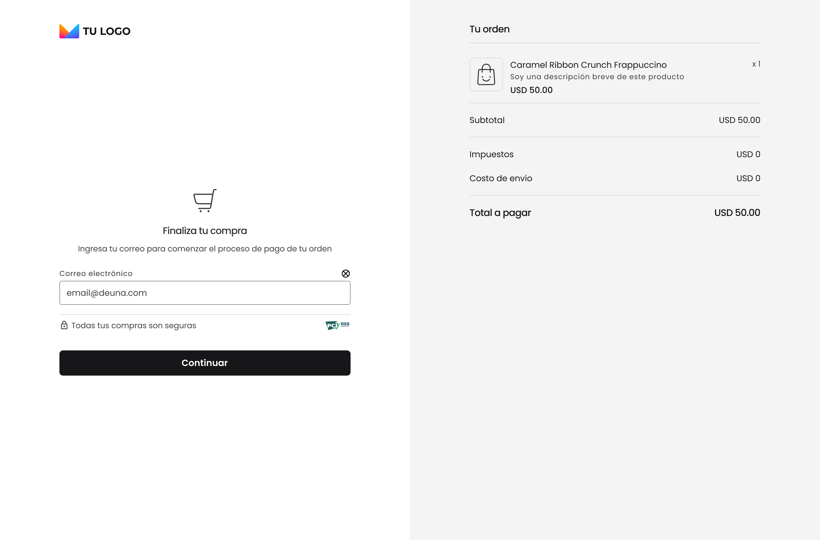
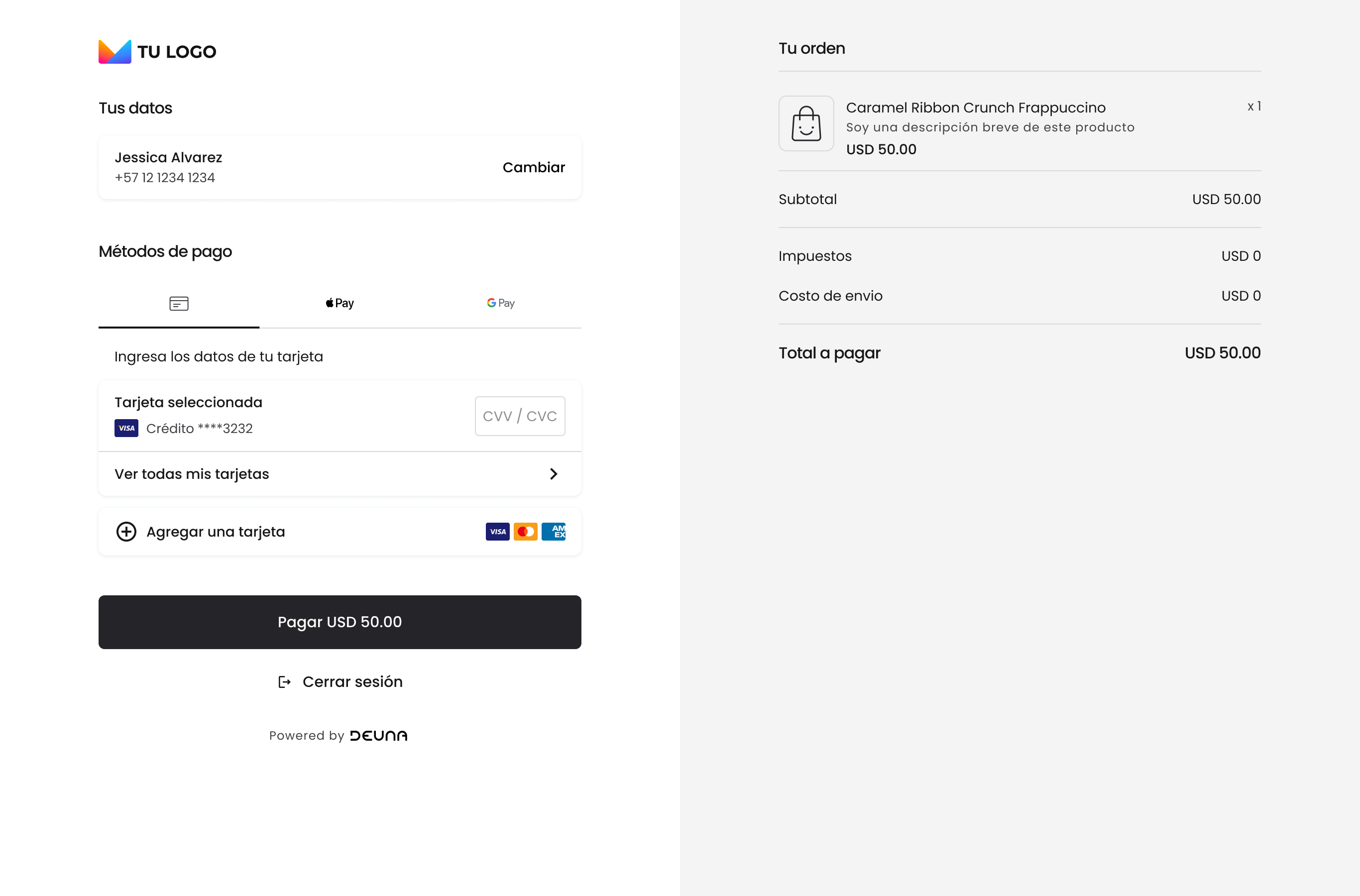
Include your business logo in the Payment Link.
Include your business logo in the Payment Link.
Including your logo reinforces your brand identity and generates trust in your customers by recognizing that they are interacting with a reliable business.
- Position: Whether your logo is left-aligned or centered. By default, it will be left-aligned.
- Size: Sizing and pixeling of your logo.
- Primary color: Primary color will be applied to all buttons and calls to action (CTA). The colors associated with your brand create visual consistency and guide user action by highlighting CTAs
- Language: The language is automatically set based on the country in which your business operates.
This allows you to ensure your customers interact in their local language, reduces friction, and increases conversion rates. - Base URL: Customize the URL for your store.
- Example:
https://payments.<store name>.deuna.com.
- Example:
Identity document validation
Enable requesting the payer's identity document when making card payments.
This field can be useful in countries where it's mandatory due to local regulations or where you prefer to implement additional security and anti-fraud controls.
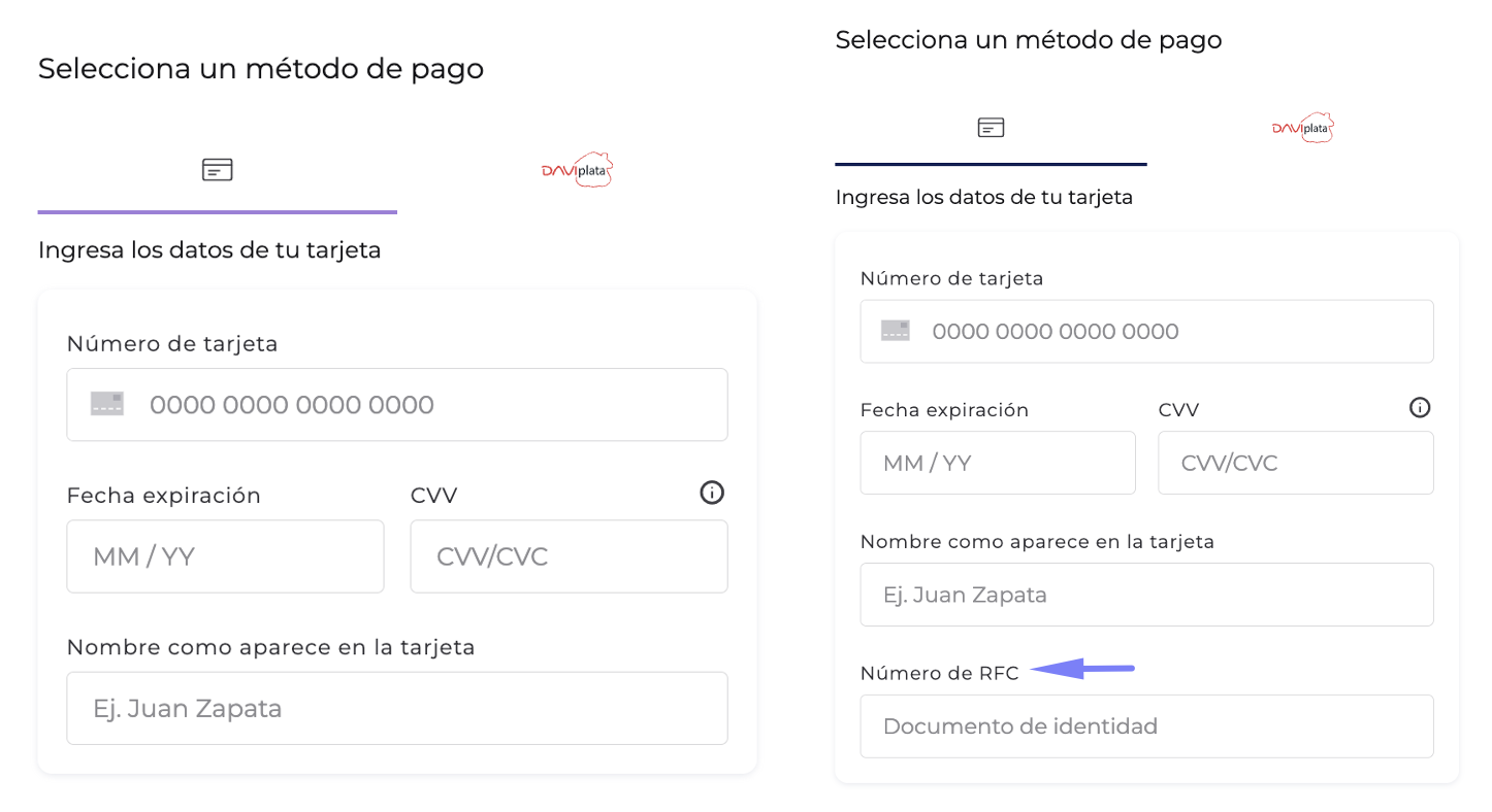
Billing data
Show or hide data related to billing.
The flexibility to show or hide this data is useful for implementing additional controls according to your needs.
In code it's called:BillingPattern.
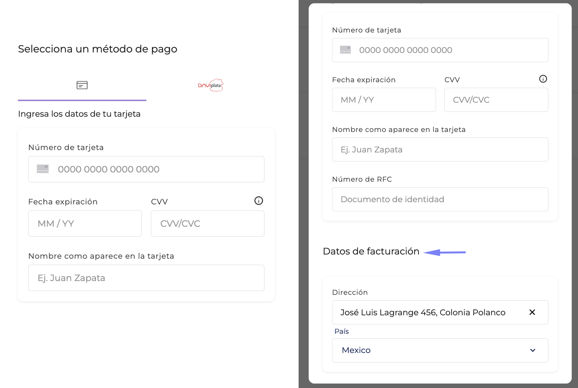
Define in which view the data will be presented:
Main view: In this view you can present a maximum of four data fields.
If you want billing address fields to be shown on the same page, make sure there are a maximum of four.
- If the order already includes previously filled billing data, then a summary of this information will be shown instead of input fields. Otherwise, users must complete the corresponding fields before continuing with the process.
- Independent view: The user can access this view through a button to add additional data.
Define which billing data will be requested and in what order they will appear in the interface. This allows you to customize the experience according to your business needs:
- First name
- Last name
- Identity document type
- Identity document number
- Phone number
- Address
- Postal code
- Additional address data
- City
- Department / Municipality
- Country
For billing data it's important to consider the order of fields when setting them up, considering putting country before state and before city.
In code they are called:LoginPatternandUserInfoPattern.
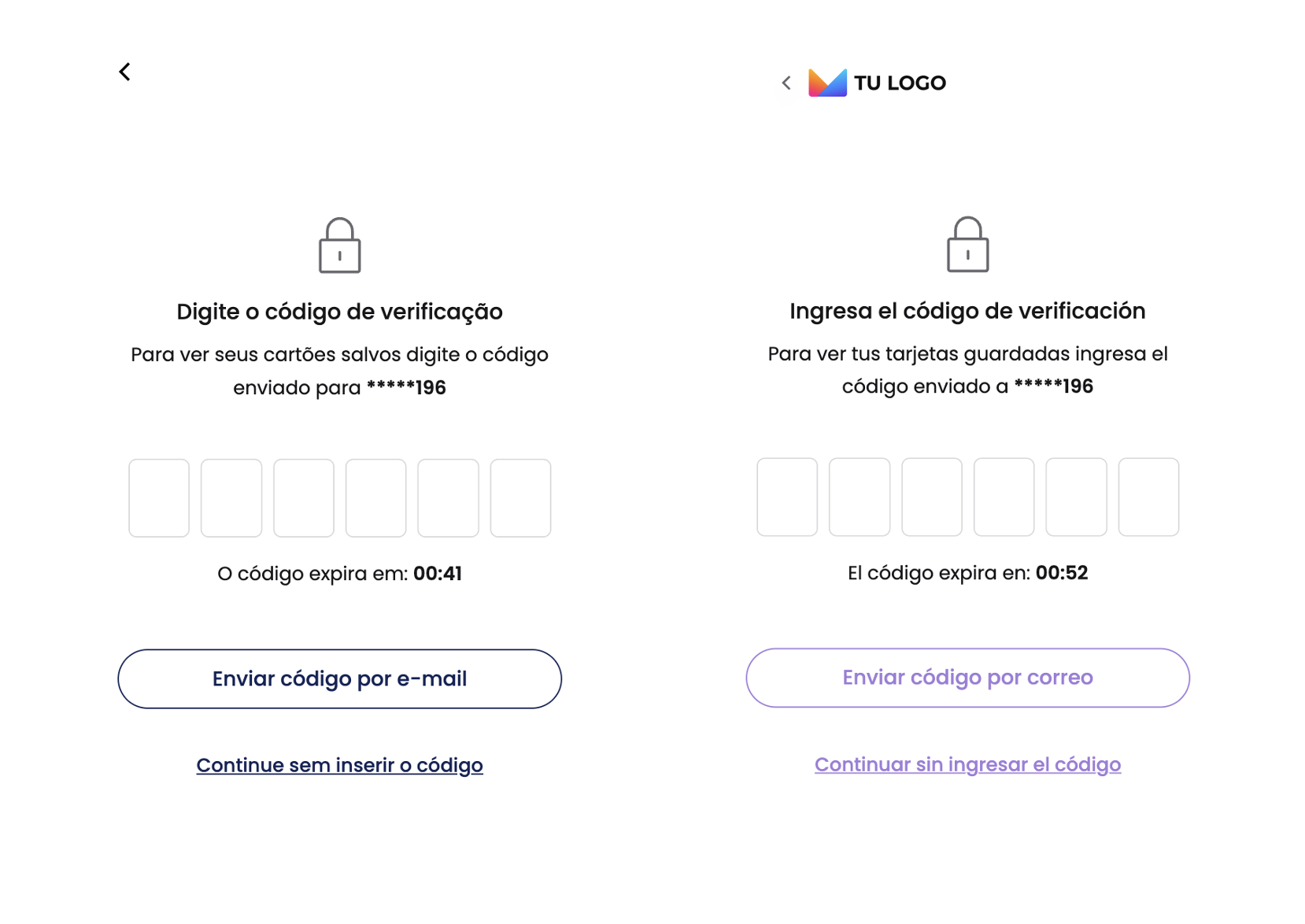
Registered users
Define if you want your users to be able to find their previously filled data to speed up the shopping process and maximize conversion.
This flow is possible through requesting an OTP (one-time password) that can be sent to the users' email or phone.
In code it's called:OrderDetailPattern.
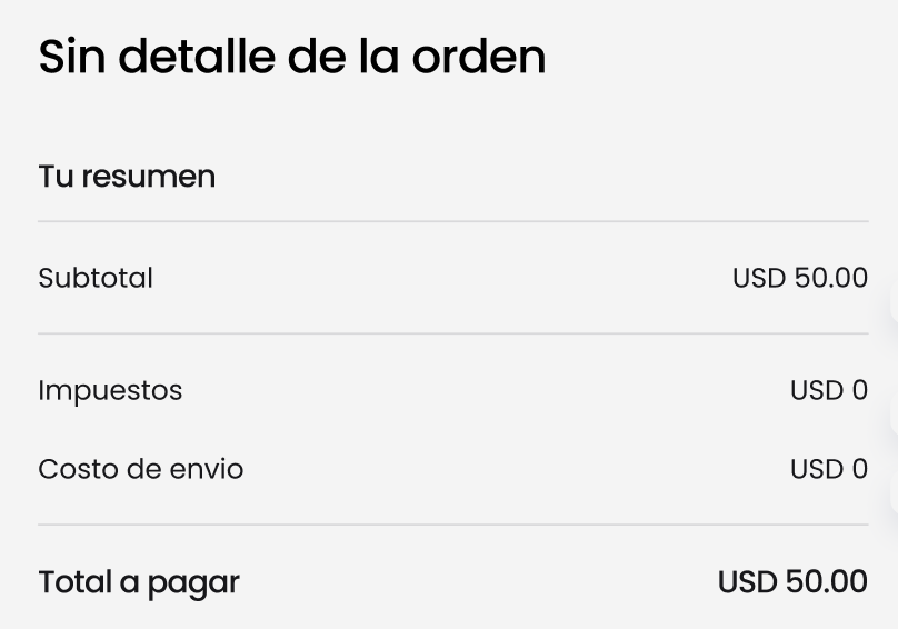
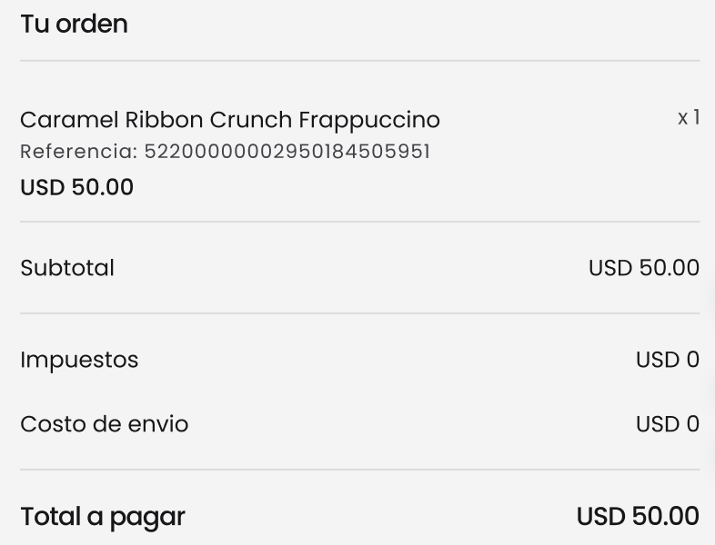
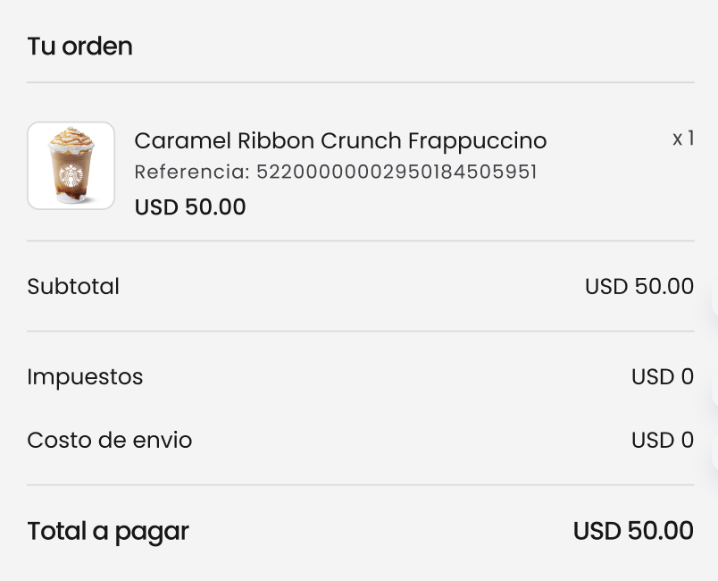
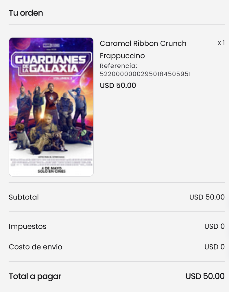
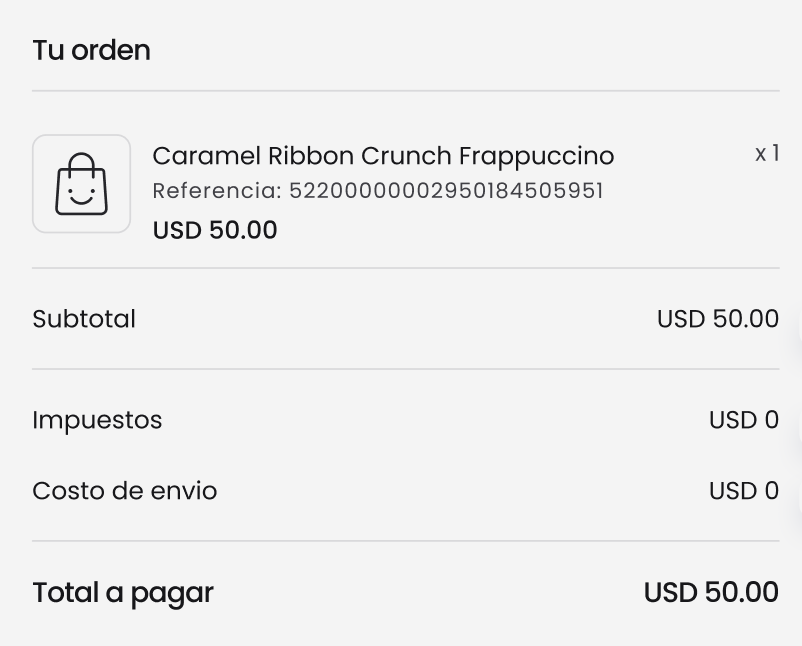
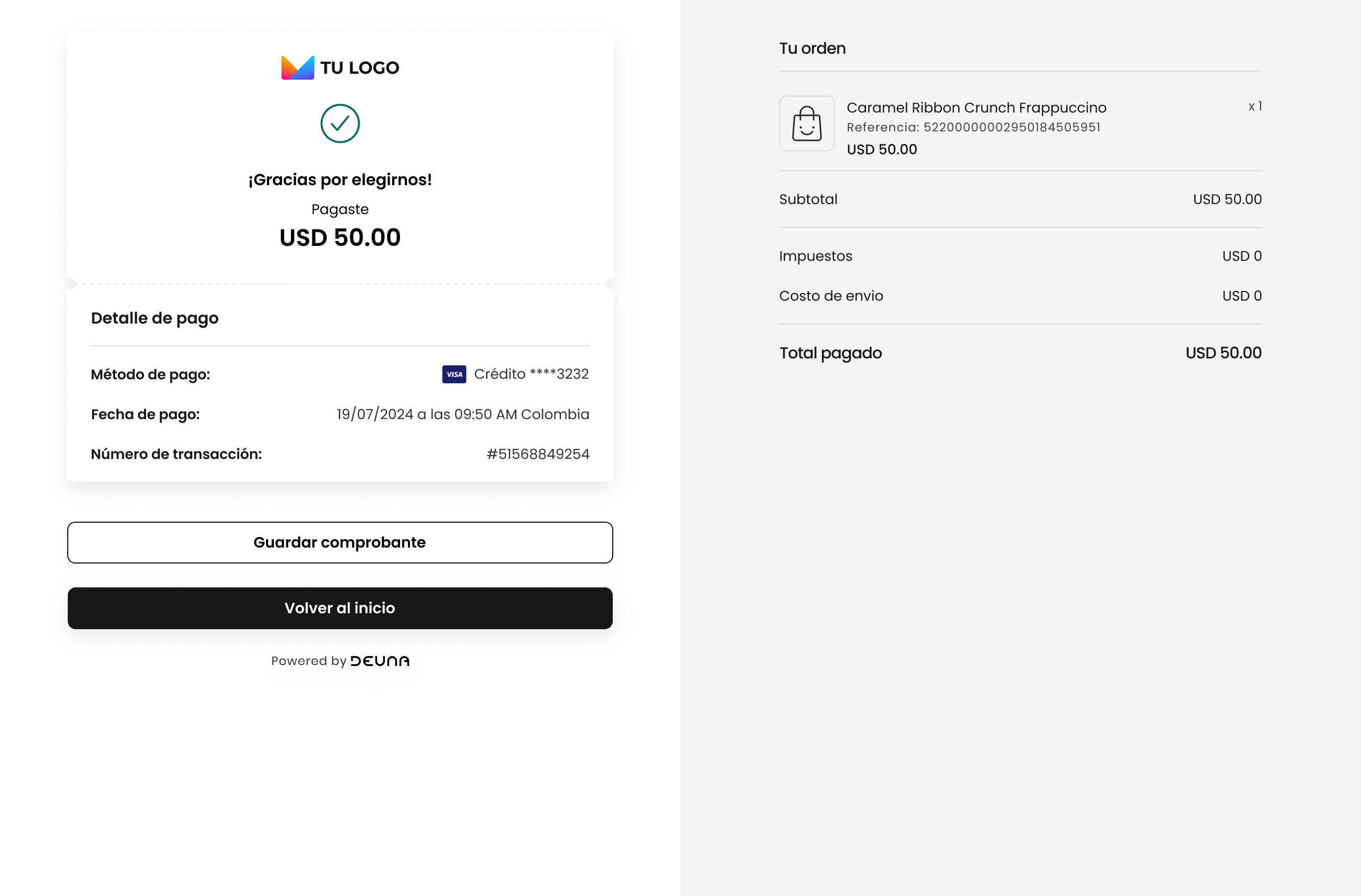
Order summary
Show or hide the shopping cart, which includes the details of included products and the breakdown of payments that the user will make.
The flexibility to show and hide this data is useful so that your users can find the summary of their purchases.
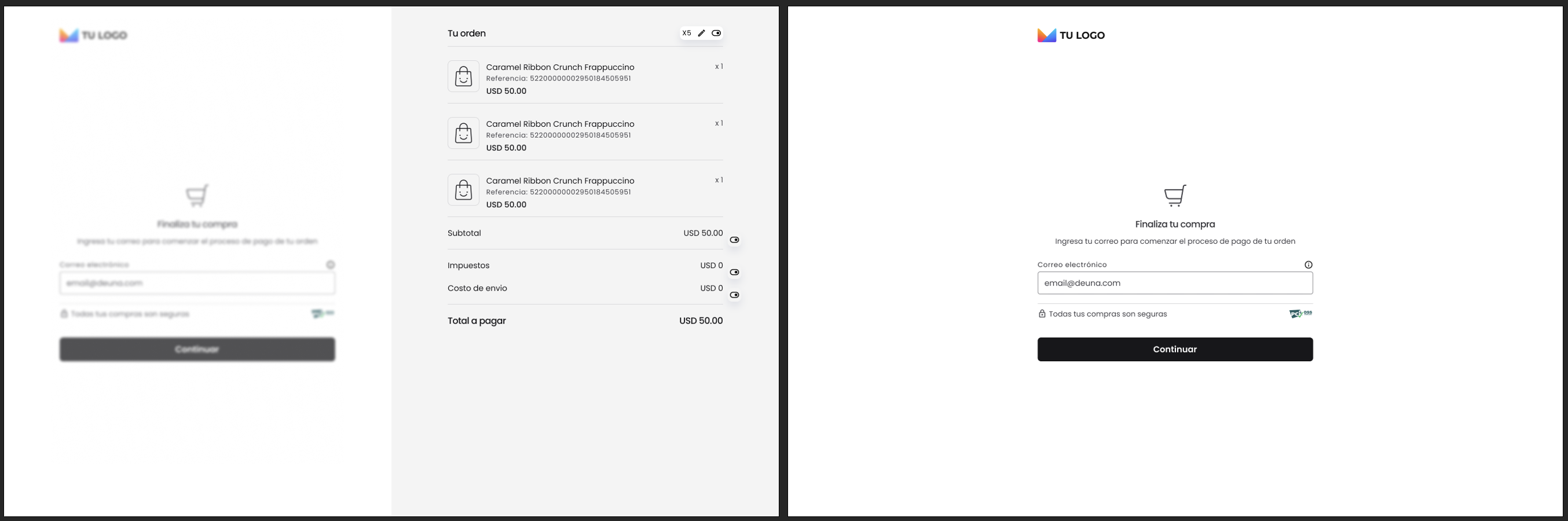
Show or hide details such as:
- Taxes
- Shipping costs
- Subtotal
Without product details
Without image
With small image
With large image
With default image
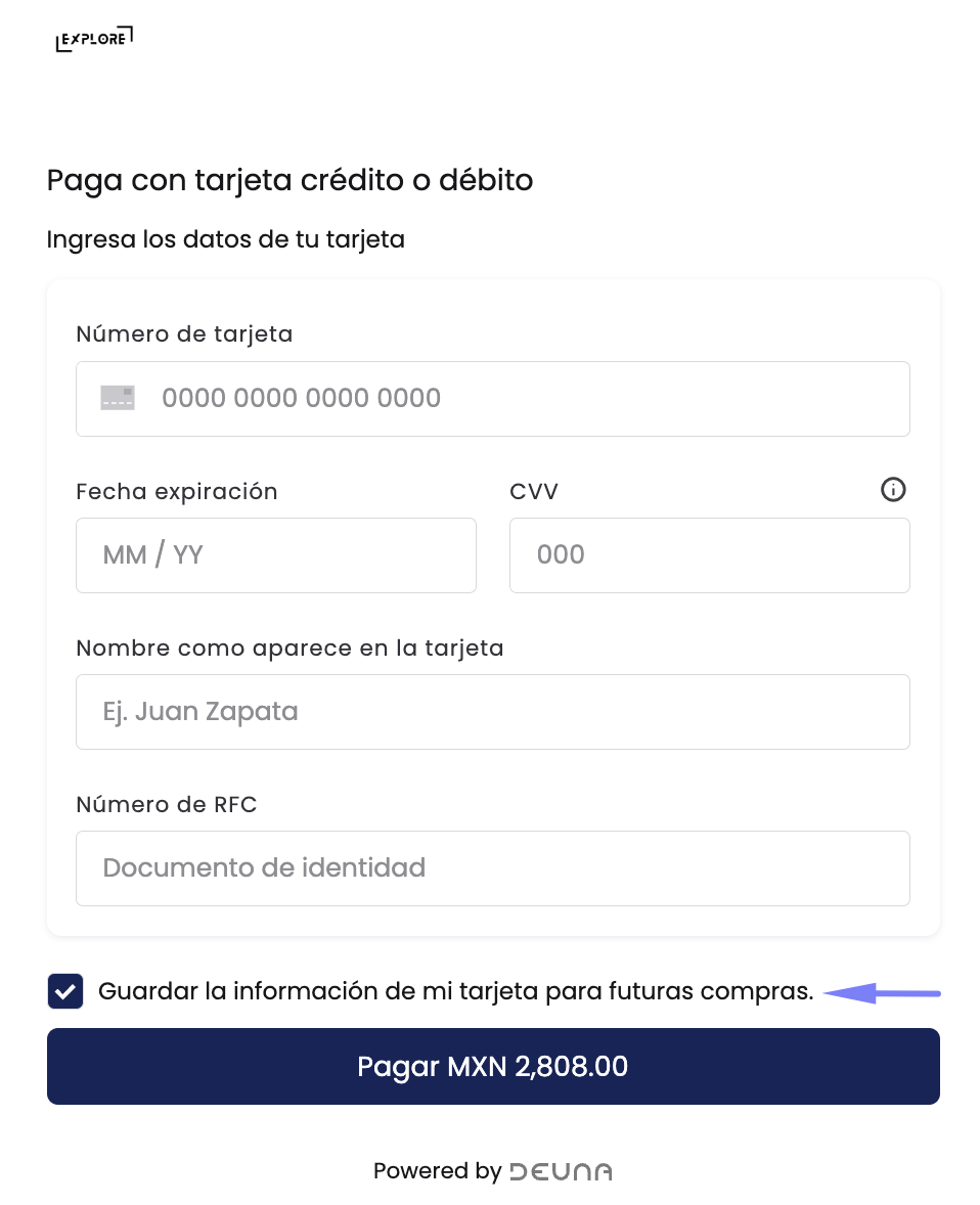
Card Saving
For users who enter as guests, it's possible to define if they have the possibility to decide if their cards are saved or if this is done by default.
The default option will be to not show the checkbox so that all your users can be registered and facilitate their shopping process which will increase conversion.
Thank you page
Show or hide the page that indicates the final payment status.
If your store already has all the necessary information to close the order, then you can also show your own page by listening to events
For more information, refer to Checkout widget - Web.
Updated 7 months ago